Showing posts with label comparison. Show all posts

Thursday, August 25, 2011

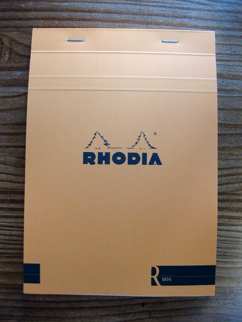
New R by Rhodia tablet: my new favorite paper!

IMG_8794lev

I just got my latest, greatest order in from Goulet Pens, and I couldn't be more excited. I have been eagerly anticipating the new R by Rhodia soft-touch notepads for longer than I even knew. More on that in a moment.

I warn you, this is going to be a long and photo-heavy review. But you already know that if your page is loading as slowly as mine is. I think it will be worth it, though.

First, you might want to acquaint yourself with the hype. Brian Goulet did a wonderful video on his Ink Nouveau blog that gives an excellent review of the new product, and a nice overview and comparison. I wish I had remembered to take a photo of this paper in comparison to other papers, but I didn't - I think he does that in the video. Anyway, worth watching.
IMG_8800lev

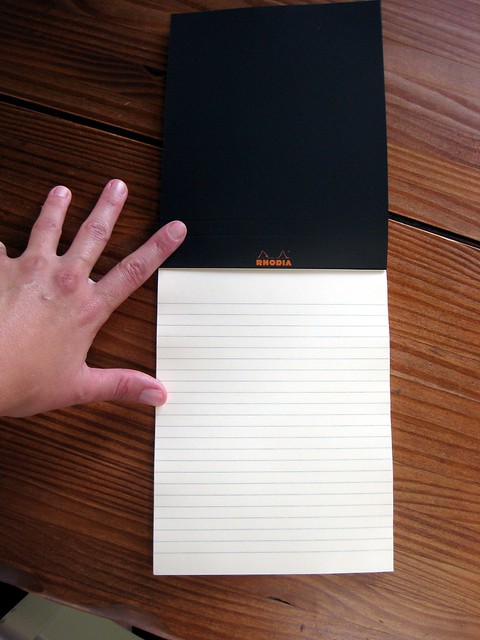
So here is the awesome new paper. It is a gentle ivory/cream color. It does not detract from any ink color, but it's not SCREAMING BRIGHT WHITE like Clairefontaine Triomphe and most of the Clairefontaine notebooks, including my current ink journal. Nor is it screaming bright white like the other, original Rhodia pads.
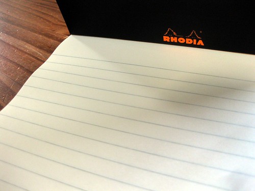
Inside of new R by Rhodia No.16 tablet, close-up

Also unlike the other Rhodia pads, there is no margin, and the lines (this is also available in blank, but I started out with the lined version) are sort of a soft grey, not blue. Subtle. Nice touch. I like the ruling. It's a good width for me. (I just checked, for those of you that want precision: it's 7mm.)

But it's really about the paper, and how well it takes ink. This new pad is an "upgrade" to 90g paper from the previous 80g. It does feel slightly thicker to the touch. In his video, Brian said it was nearly as smooth as Clairefontaine Triomphe, and I would mostly agree with that, but it doesn't have the Triomphe's "glassy" quality... which, in most cases, is a plus. I wouldn't say there is drag on the paper, and there is definitely not "tooth"... it's just a lovely smooth surface.
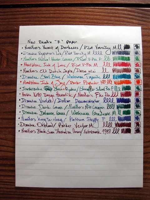
Fountain pen ink test on new R by Rhodia No.16 tablet

Again, though, it's all about the ink. And this is where this paper really excels. For those who like their colors harmonious, I apologize, as I just grabbed pens with excitement in no particular order, other than thinking, "this is a juicy wet pen!" or something like that... really putting the paper to the test, as it were.
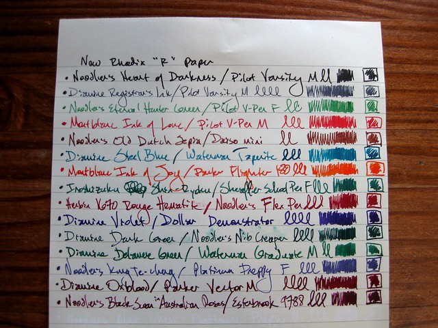
IMG_8792lev

As you can see, no feathering. Slight smudging, due to wet inks and my smudgy over-writing hands (+ general impatience). Ink dries significantly faster on this paper than on Clairefontaine Triomphe: a significant plus! All of the inks played nicely, even one of my newest, least favorite inks: Noodler's Old Dutch Sepia; this is the only paper I've tried it on yet where it doesn't feather! (It's humid here in August. That happens. I hope it will be have better in the winter, when everything, including my pens and papers, is less damp.)

Inks and pens shown:
Noodler's Heart of Darkness / Pilot Varsity M
Diamine Registrar's Ink / Pilot Varsity M
Noodler's Eternal Hunter Green / Pilot V-Pen F
Montblanc Ink of Love / Pilot V-Pen M
Noodler's Old Dutch Sepia / Daiso Mini
Diamine Steel Blue / Waterman Taperite
Montblanc Ink of Joy / Parker Flighter 180
Iroshizuku Shin-Ryoku / Sheaffer school pen F
J. Herbin 1670 Rouge Hematite / Noodler's flex pen
Diamine Violet / Dollar Demonstrator
Diamine Dark Green / Noodler's Nib Creaper (firm/non-flex)
Diamine Delamere Green / Waterman Graduate M
Noodler's Kung Te-Cheng / Platinum Preppy F
Diamine Oxblood / Parker Vector M
Noodler's Black Swan in Australian Roses / Esterbrook 9788
Noodler's Blue Ghost / Platinum Preppy M
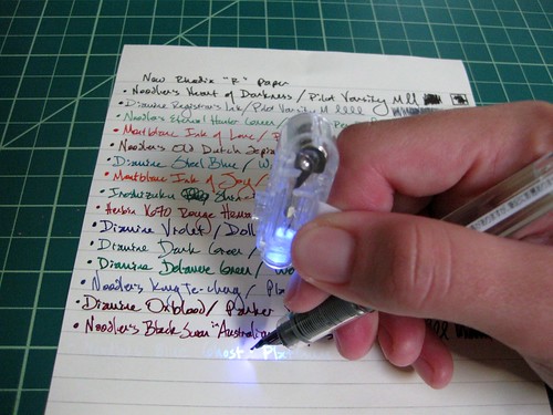
Writing with Noodler's LED backlight on my finger to reveal the Blue Ghost

Slight tangent - if you thought the last line of ink was Noodler's Black Swan in Australian Roses, you thought wrong! Included in my order from Goulet Pens was the awesome Noodler's Blue Ghost invisible ink, which shows up with a black light on non-bleached papers. COOOL! Goulet pens also sells this ingenious set of black light rings that you can attach to your pen or your finger as you write, illuminating in black light just your area of writing. Trust me, this is key: it is eerie to be writing if you can't see what you're writing! I'm writing with a Platinum Preppy M, which came from Goulet Pens already as an eyedropper conversion (and folks, I am happy to pay the extra $2 to Goulet Pens for them to do the eyedropper conversion for me - it's a time-saver, so this pen came all ready to go), and for a specialty ink such as this, I wanted to make sure to use a brand-new pen. Platinum Preppy eyedroppers are one heck of a great bargain for about $6 from Goulet Pens!
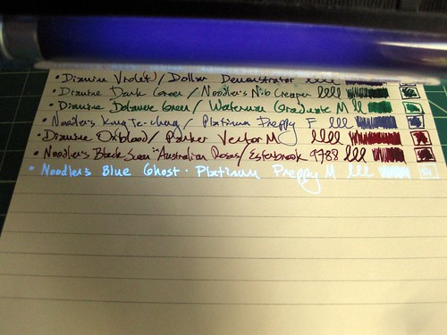
Noodler's Blue Ghost under black light

I do happen to have a larger black light, which is handy for the reading part, not so much for the writing... but it allows me to show you the whole line of ink and not just part of a word.
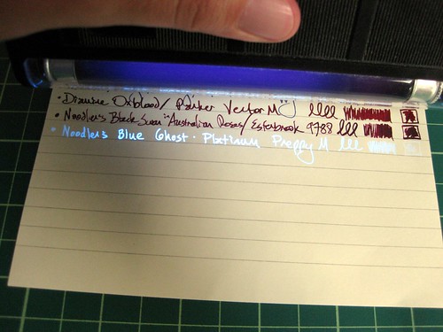
Noodler's Blue Ghost under black light 2

With the ivory color of this paper, this ink looks fabulous! It does not show up at all in my bright white Clairefontaine ink journal... that paper is just too white.

IMG_8793lev

So back to the paper. This photo above is the most exciting photo to me of the whole bunch, and if you're a real fountain pen/paper aficionado, you'll guess why. This is the back of my ink tests page. Not only is there no bleed-through, there's not even any SHOW-through! You can only tell there is even writing on the other side if you look really closely. WOW! And I even flexed my flex nibs with Noodler's BSIAR and Herbin's 1670 Rouge Hematite inks... wet inks in very wet pens! LOVE it. This, as much as anything else, is why this is my new favorite paper. I will use it for second/additional sheets in letters, and I can write on both sides with ease. It's also a great size for the sort of stationery I prefer to use.
IMG_8796lev

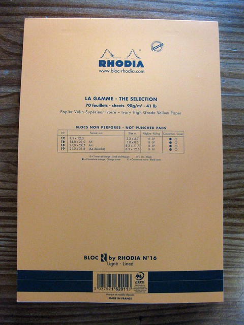
And finally, the back of this wonderful tablet. It comes in many sizes, both lined and blank, with black and orange covers. (The inside of the cover has the inverse color.) I chose orange this time, since my other Rhodia pads have black covers.

Important note: I am not affiliated with Goulet Pens, I am just a happy repeat customer. Here's the buying info: R by Rhodia No.16 tablet, 70 sheets for $7. This stuff is new and freshly out, but other retailers may be carrying it now as well.

Wrap-up:
If you wanted pretty much the paper that comes in Rhodia webnotebooks but in micro-perf tablet form, this is it.
If you wanted "off-white Clairefontaine," this is it.
If you want a great, high-quality writing paper for a great value, this is it.

Highly, highly recommended!

Tuesday, August 23, 2011

Comparison of grey fountain pen inks

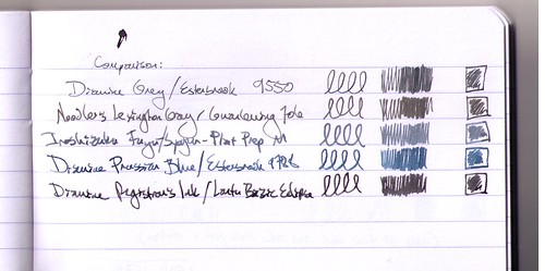
Grey ink comparison, scan

If you've read my blog for a while, you know I keep an ink journal to keep track of all my fountain pen inks. I update it every time I refill or clean a pen, so it's a great record of maintenance, and of course it helps me remember which ink is in which pen! But I also play around in it from time to time, and ink comparisons are always great fun. I had a yen a while back to compare my grey inks - or at least, the grey and blue-grey inks I had loaded in pens at the time.

What you see above is a scan of that comparison.

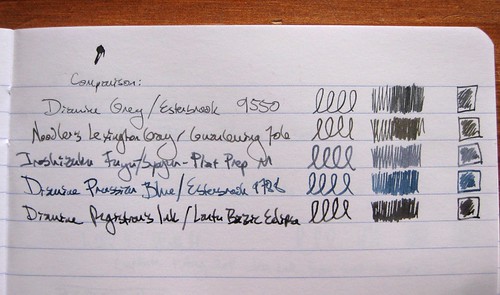
Grey ink comparison, photo

I also took a photo of the page, in natural light (indirect sunlight), and to my eyes, this one (the photo above) is a far more accurate portrayal of the colors. But some people prefer scans to photos, so in the interest of a full range, I used both imaging options.

I hadn't realized, until I put them all together like this, how very greenish the Noodler's Lexington Gray is.

The inks and pens listed above:
Diamine Grey / Esterbrook 9550 (EF)
Noodler's Lexington Gray / Guanleming 706 EF
Iroshizuku Fuyu-Syogun / Platinum Preppy M
Diamine Prussian Blue / Esterbrook 9788 (M)
Diamine Registrar's Ink / Lantu Bazic Eclipse M

The Registrar's Ink and the Lexington Gray are both waterproof, so they show up on postcards with some regularity. The others are for the innards of a letter or a journal.

Do I have a favorite? I guess I'd have to flag the Iroshizuku Fuyu-Syogun and the Registrar's Ink as current top picks, both for the color and behavior.

For those who are as geeky as I am about this sort of thing, these comparisons are in a Clairefontaine Basics clothbound journal, just like this one I blogged about over a year ago, except the current incarnation has a black cover. I'm pretty happy with using this journal as an ink journal, but when I finish this one, perhaps I'll branch out. Who knows.

Friday, April 16, 2010

A whole lotta reds, burgundies, and some imposters

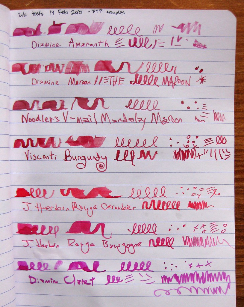
Quasi-burgundy (??) samples

Remember that post about my ink samples from Pear Tree Pens? Well, here are toothpick samples of many of them. In the aforementioned post, I mentioned my quest for the perfect burgundy. Let me tell you, none of the above samples are it! I will reiterate my distaste for pinkish burgundies, and most of these seem to be that. Diamine Claret? Come ON, people, that is just HOT PINK! The caveat is that these inks DO look different in pens, I have put some of them in pens and discovered that I still don't like them. The Mandalay Maroon and Diamine Maroon are both chalky, and just not the color I wanted. The Visconti Burgundy is quite nice, actually, but to me it is more of a red. Some of my own dark reds are closer to burgundy than the Visconti Burgundy. As for the Herbin samples, I've never met a Herbin red I liked. Those won't even see the inside of one of my pens. (Golly, maybe I should do a giveaway of all these wee ink samples I don't like!)

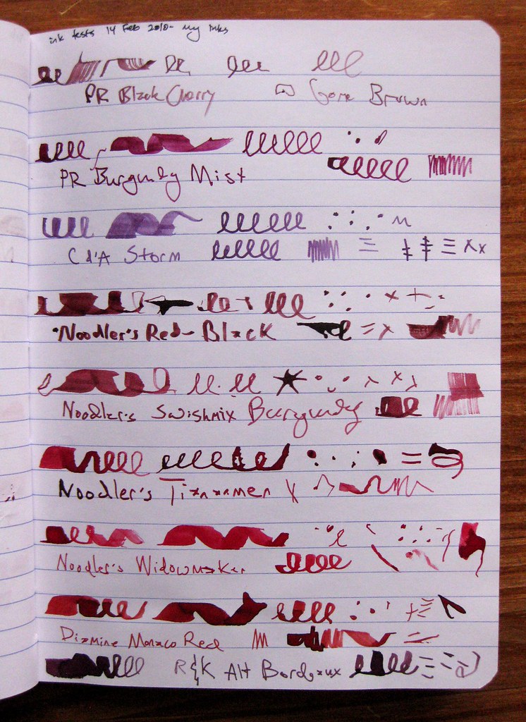
Burgundy/Dark Red inks

This photo, for comparison's sake, shows the dark red/burgundy inks I DO like. Many of these are in bottles, a few are samples. You have already seen examples on this blog of how different some of these inks look in a pen (see "a few red inks"). I don't really consider Monaco Red or Tiananmen to be burgundy or maroon, but they're great dark reds. PR Burgundy Mist is a GREAT color, but it dries really slowly (as nearly all the PR inks do), and that color is infamous for turning to brown after the bottle has been open for a while. R&K Alt Bordeaux is one of those purplish burgundy inks I actually DO like; can't really say why, it's just a color I really dig. I have that in one eyedropper pen that needs a refill right now, hmm.... Interestingly, Caran d'Ache Storm actually looks much darker in a pen - I don't care for this toothpick sample, but in a pen it's lovely. I only have a sample of that, but someday I may buy it in a bottle...

For search purposes, inks shown in this post are:
Diamine Amaranth
Diamine Maroon
Noodler's V-Mail Mandalay Maroon
Visconti Burgundy
J. Herbin Rouge Caroubier
J. Herbin Rouge Bourgogne
Diamine Claret
PR Black Cherry
PR Burgundy Mist
Caran d'Ache Storm
Noodler's Red-Black
Noodler's Swishmix Burgundy
Noodler's Tiananmen
Noodler's Widowmaker
Diamine Monaco Red
Rohrer & Klingner Alt Bordeaux

Sunday, April 4, 2010

A few red inks

IMG_5797crop

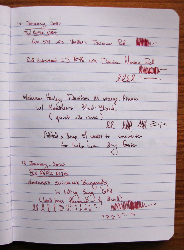
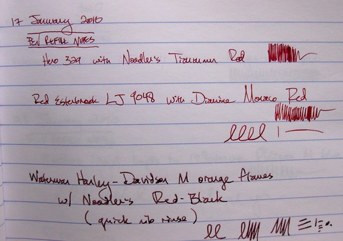
Here are some of my dark red inks, shown in pens and not in toothpick samples. We have Noodler's Tiananmen, Diamine Monaco Red, Noodler's Red-Black, and Noodler's Swishmix Burgundy. This is probably a fairly accurate representation of the colors, though most of the nibs were very much on the fine side. As for the Noodler's Swishmix Burgundy at the bottom, I have to admit I do not much care for it. I find it chalky, and that really bugs me in an ink in ways I can't even explain. If you have a Flickr account, you might like to see a larger version of this photo, where you can see the subtleties of the inks.

IMG_5800crop

Next we have a cropped version of the top three inks, which I do like. This was not a conscientious red ink comparison, I just happened to refill a bunch of dark reds at once.

I have a love-hate relationship with the Noodler's Red-Black, which is usually too brown-looking for me. On some papers, usually coated postcards, you can really see the red undertones of the ink, but on most papers it ends up looking sorta brown like this. The upside is that it's partly waterproof - the black component is waterproof, so the red may wash away but the black will stay.

The Tiananmen and the Diamine Monaco Red have very special places in my heart. It doesn't hurt that the Monaco Red is in one of my very favorite pens - a red Esterbrook LJ with a semi-flexible 9048 nib. It's a joy to use, and the shading (color/saturation variation) in the Monaco Red is lovely.

Are you getting sick of the ink stuff? I am, a little bit. I have more ink photos in the queue, but I believe for my next post I'll jump ahead in said photo queue and post about a letter.

Tuesday, March 30, 2010

Diamine ink comparison, in pens

IMG_5785crop

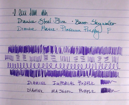
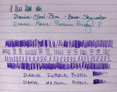
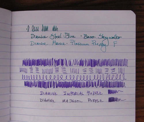
To follow up on that post I did a few days ago on the Diamine inks, here I have photos of them loaded in pens, with the two similar colors next to each other.

IMG_5788crop

The Steel Blue definitely looks darker, deeper, and with more jewel-green undertones. Of the purples, all the scribbles are with Imperial Purple. I did not note the pens for those, either, mea culpa: the Imperial Purple is in a Lamy Vista F, and the Majestic Purple is in an Esterbrook SJ with a 2550 nib.

IMG_5792crop

Yep, they're similar colors! I do like the Majestic Purple, but whenever I see it next to the Imperial Purple, I like the Imperial Purple a lot more.

IMG_5792cropNoEdit

Yes, I do a little bit of levels/color correction in my photos; just for comparison, the above photo is unedited/corrected for light and shading.

Monday, March 29, 2010

Three Pilot Iroshizuku Inks

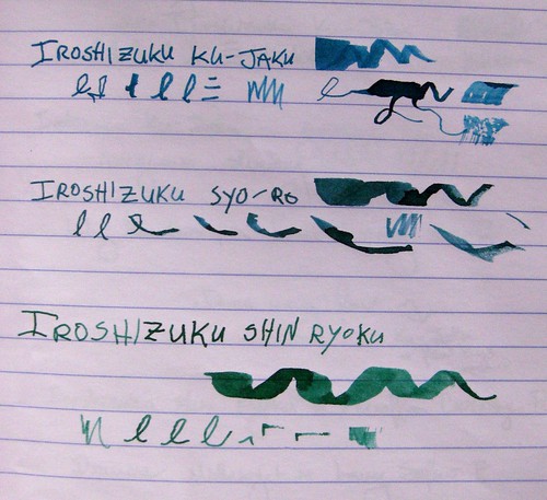
Three Pilot Iroshizuku Ink comparisons, I

Like I said, we'll be on this fountain pen ink theme for a few posts straight, folks. Bear with me.

Here are three inks from the Pilot Iroshizuku series. It's a Japanese ink that is rather expensive... some folks think it's overpriced but I've found it's pretty darn fabulous. These are probably my three favorite inks right now. If you've heard me talk ink, you know I really love the fine lines between blue and green: the blue-greens, the green-blues, etc... and I love me a good, rich, dark green. So I am completely thrilled with these three.

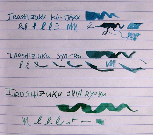
Three Pilot Iroshizuku Ink comparisons, II

As with other ink photos, I've taken these in natural light from a variety of angles. Photographs do not do this ink justice - it has so much richness and depth, beautiful shading, and it really does look that gorgeous in a pen. I hope to have writing samples from a pen up here someday, but these are toothpick lines just like yesterday's post.

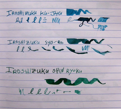
Three Pilot Iroshizuku Ink comparisons, III

These inks are starting to become more widely available in the U.S. (I can't speak for other countries, sorry, except that they come from Japan) but I bought mine from JetPens, one of the first retailers to bring them all over here. I know I've talked about JetPens before - fabulous customer service and incredible shipping rates - free with a purchase of $25 or more in the USA. Wow. Anyway, the colors I have here are as follows:

Ku-Jaku / Peacock (Deep Turquoise)
Syo-Ro / Pine Tree Dew (Dark Turquoise
Shin-Ryoku / Deep Forest Green (Deep Green)

I linked to the product pages because the bottles are so darn pretty, too. Even the boxes are gorgeous.

Most importantly, this is the best-behaved ink I have ever used. Ever. It flows perfectly, and it dries instantly. I have yet to smudge it, even from a wider nib on slick paper like Clairefontaine. Hooray! I love this ink and definitely think it's worth the heftier price tag. I still covet a couple of the other colors, particularly Tsuki-Yo (Night Sky), but those may have to wait a bit...

Sunday, March 28, 2010

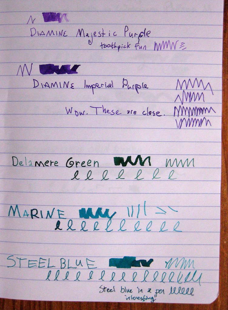
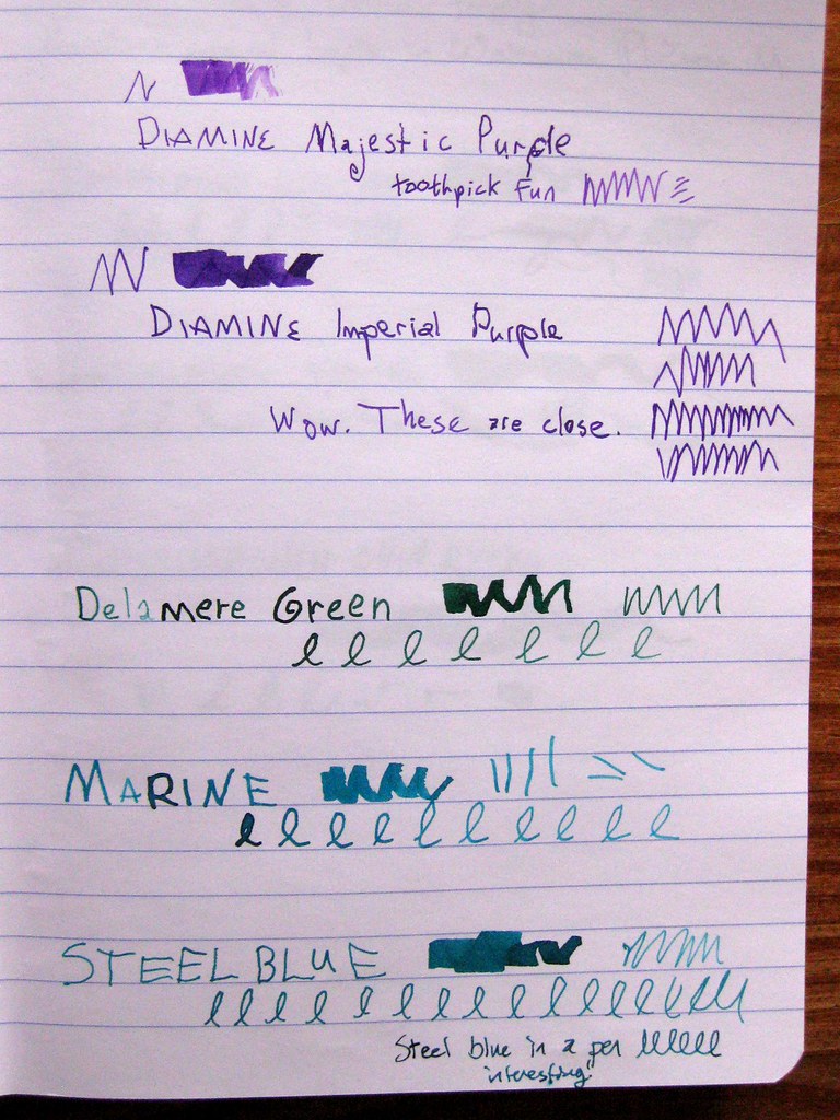
Five Diamine inks

5 Diamine inks in ink journal, I

Here we have a very unscientific comparison of 5 fountain pen inks by Diamine: Majestic Purple, Imperial Purple, Delamere Green, Marine, and Steel Blue. They are done with toothpicks in the ink, except that the bottom example of Steel Blue also has a writing sample with the ink in a pen.

5 Diamine inks in ink journal, II

These samples are in my Clairefontaine ink journal, and they were taken with no flash in natural sunlight. I turned the journal three different directions on the table, so you'll see a slightly different angle for the lighting. Some people don't care, but I do - I like to see the subtleties, especially when I'm trying to make judgments on a computer screen.

5 Diamine inks in ink journal, III

Diamine is an English maker of fine fountain pen inks, and I recently purchased a whole passel of smaller 30ml bottles directly from them. Shipping from the UK wasn't all that bad, all things considered, and I like trying out the colors in the smaller bottles. I knew that I'd be getting some similar colors, and I am pretty fascinated by the results of how similar Imperial and Majestic Purple are, as well as Steel Blue and Marine.

The Delamere Green is sort of the odd duck - it's not similar to any inks on the page, but it is a gorgeous dark green with a deep hint of blue.

Warning: I'm about to get geeky about ink, so if you're a general letter-writer reader, you might not dig into this next bit. (Maybe I've lost you already.)

I am really in love with Diamine inks these days. The color variety is beautiful, the saturation is excellent, the shading is almost always pronounced and fabulous, and the behavior is near-perfect: good flow and VERY fast dry time. I've bemoaned the fact before that I am right-handed, but I write like a lefty: I'm an "overwriter" which means that I curl my hand around, and my hand sits on top of the lines I've written above. For a slow-drying ink, this means almost certain smudging unless I place a very careful blotter on top of the paper. With Diamine inks, this is almost never necessary.

In a separate post I will show off Diamine Violet, which I only got as a sample - that is the one bottle I am certain I will buy in a larger size. As for the purples, I have a slight preference for Imperial because it is more blue, and Majestic is more on the pink/magenta end.

I shall almost certainly acquire a larger bottle of Delamere Green.

Marine or Steel Blue? They are just too similar to buy both, but I'm undecided. They behave differently in pens, of course, and I'm just going to have to try them both out in different pens. So far I tend to lean towards Marine, because Steel Blue is so similar to another color I love: Private Reserve Blue Suede.

So many inks, so little time...