Showing posts with label stationery. Show all posts

Sunday, January 24, 2016

2016 sticker organization system

Large sticker books

In my previous post about my newly organized writing desk and study, I mentioned I had a new organization system for stickers and stamps, and that I was considering separate blog posts about said organizational systems. Blog readers were so enthusiastic about that prospect that I must deliver! So here's a look at my new organization system for stickers.

A little background: I have a lot of stickers. You will see that in this post. I use them almost exclusively for mail and mail art, decorating envelopes, letters, postcards, etc. Previously they were fairly loose and unorganized, floating through desk drawers and scattered on my desk in piles and mis-matched envelopes... they were a mess. I could never find anything. I would say, "hey, this person loves owls, I know I have some adorable tiny owl stickers somewhere," and then I would root through desk drawers searching for them. It was a waste of time. I always meant to organize my stickers, but it was a pretty huge project. As I was setting up my writing desk, I had both energy and inspiration, and decided to do it. I should have taken photos of all the piles of my stickers as they were spread out across the entire study floor, but I didn't. Oh well.

So, my current system involves the following components, all of which I will show and explain:
  • Large sticker books
  • Small sticker books / boxes of stickers
  • Loose stickers sorted by theme in pocket dividers in a 3-ring binder
  • Loose stickers sorted by theme in drawers

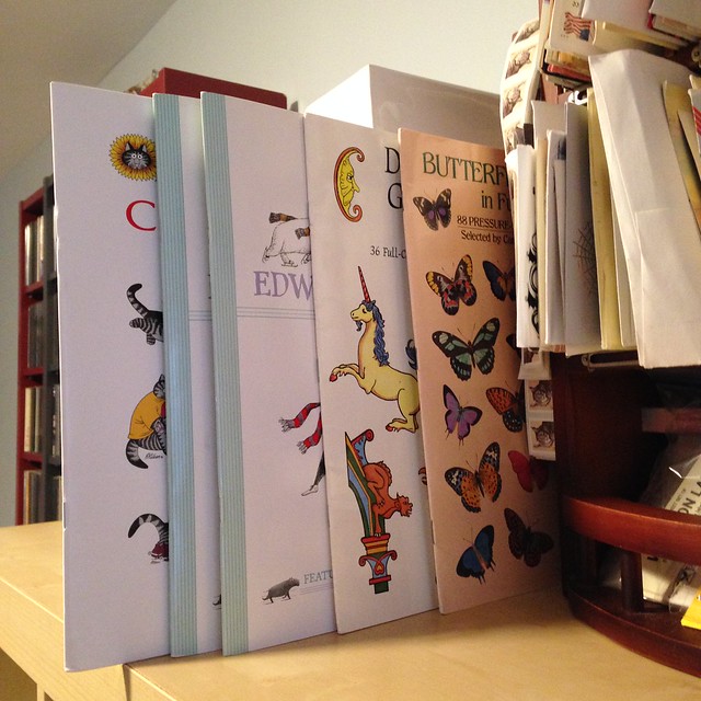
    Above we have the large sticker books, all together at last. They are all the same size, mostly but not exclusively from Dover. I am particularly fond of the Edward Gorey and Kliban cat sticker books. These live on top of my stationery shelves, normally tucked in next to my mail organizer. (If you want to see the whole setup in contect, see my previous post about my newly organized writing desk and study.)
    Small sticker books and label boxes

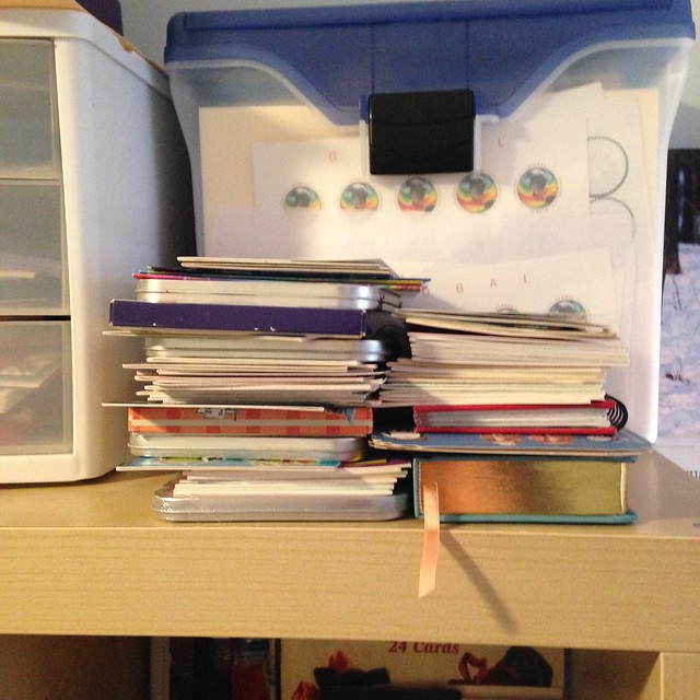
    Small sticker books and sticker boxes, which fortunately are all about the same size, are stacked in a pile on top of the stationery shelves, right next to my writing desk. This seems haphazard and isn't completely ideal, but I have in my head a fairly accurate idea of which stickers live there. The small books are almost all Dover, and include essentials like the Glitter old-time cats and kittens stickers (kitty kitsch!) and the Cavallini Par Avion Tin. There are also a couple of random notebooks and journals in there. Ooops. Nothing's perfect, folks!
    Sticker binder: fauna and mythical creatures

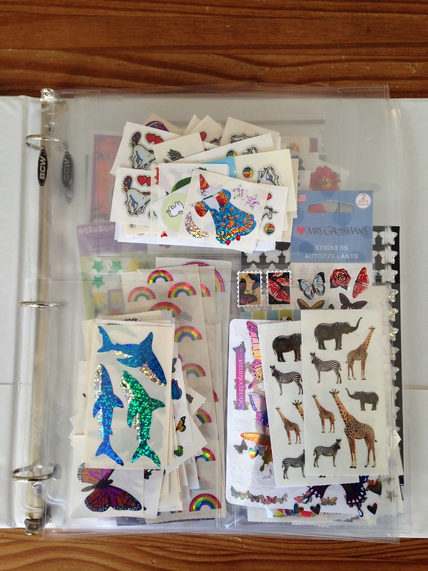
    And now, the meat of the matter: loose stickers. These were the biggest nightmare. I do not assert that my system is ideal, and I created it on the fly with materials on hand: a 3-ring binder and a few extra plastic 3-pocket postcard holders. Each pocket has a theme, and here we have fauna (glitter and non-glitter) and fantasy/mythical creatures (hello, unicorns!). You can see through to some of the pages behind it. I will spare you each and every one of the sections, but others include glitter/sparkle stars and rainbows, bats/Halloween, flora, objects, etc. This system clearly still has flaws, a major one being that it's very easy for stickers to fall out the top, so I'm careful when I'm handle it. A minor flaw is that I still have to pull them out of the sections to find something, but it is less of a hassle than rooting through entire drawers as it used to be.
    Sticker drawer: cats

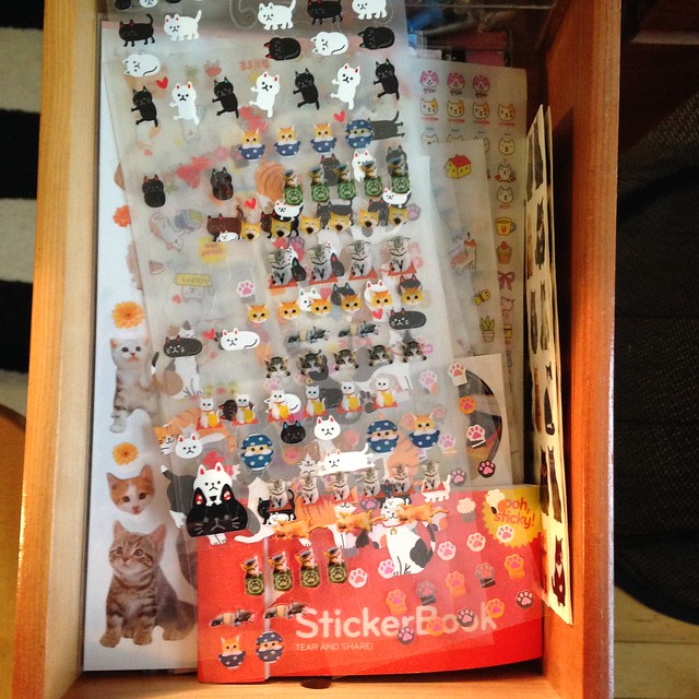
    The drawers still contain loose stickers, but each drawer has its own exclusive theme: the largest themes of the lot. This drawer holds exclusively CAT STICKERS. Ha. 'Nuff said.
    Sticker drawer: mail / writing, snowflakes

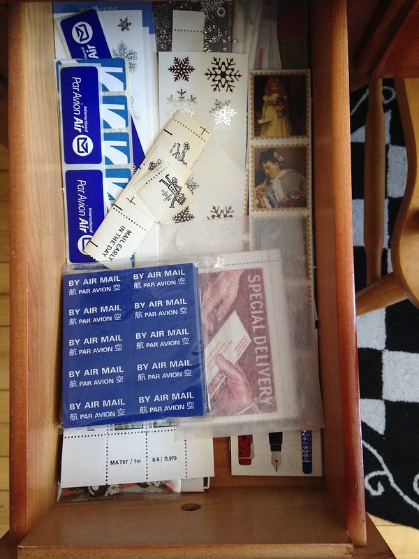
    The other drawer has one main theme with a smaller unrelated subset. The main theme is mail / meta / writing (air mail labels, mail-themed stickers, stamp-themed stickers, stickers of pens, etc) and the minor theme is snowflakes, because I tend to use a lot of snowflake stickers, and I like them close at hand.

    So there you have it. My system is highly idiosyncratic and tailored to my own tastes and collections, but so far it is working extremely well for me. I'm curious to see how this system holds up over time; I am sure I will develop some complaints, but it's better than a mess of unorganized stickers!
  • Monday, January 18, 2016

    New study and writing desk setup

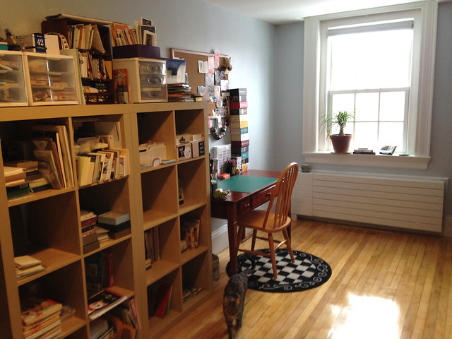
    Oberon explores the stationery shelves

    We moved five months ago, and it has taken me this long (remember how grad school ate my life?) to get my writing desk and workspace set up in my new study. Oberon and Stella were gracious enough (or curious enough) to help me with this little photo shoot, and above you can see Oberon sniffing around near that one empty shelf cubby on my paper and stationery shelves. (How long will it stay empty? Hmmm...)

    New study and writing desk

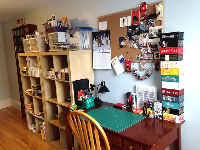
    Here's a closer look at the writing desk itself. Yes, that is a towering stack of boxed postcards on the desk, and on the bulletin board above the desk, some of my favorite received mail and mail art.

    For the first time in many years, I have a room of my own, and I won't go so far as to say I've finished the entire study -- sections of the room are carefully omitted from these photos, because they're still a mess -- but I'm thrilled to have my letter-writing materials all set up and organized.

    In the future, maybe I'll need to do a blog post about how intensely I've organized my stamps and stickers now, in a way they've never been organized before; this deep organization project is something I've long been itching to do. It's really exciting and it took me many hours to achieve, with stamps and stickers spread out all over the floor, but I finally know exactly where to find everything. Not only is it efficient, but after years of having things all jumbled together, it's also very satisfying.

    Stella in my new study

    I'm thrilled to have natural light nearby. My writing desk in DC was shoved into a dark corner, and not an entirely lovely place to write... but it wasn't an entirely lovely apartment, either. Here, I have my own room, and nice big window right next to the desk. And that's Stella on the floor, walking towards me as I take the photo.

    Best of all, this setup makes me really want to write letters! Today is my last day of winter break (back to school tomorrow), so I'd better carpe diem while I still have the time.
    Friday, October 2, 2015

    I was worried this would happen...

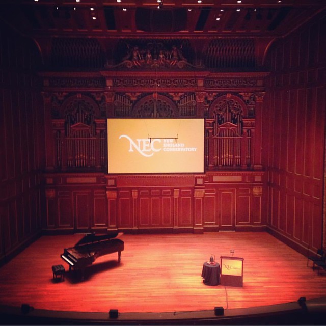
    #newenglandconservatory convocation this morning. #jordanhall never ceases to amaze me. And then they gave everyone a free t-shirt at the reception afterwards!

    Wow, is this my longest interval between posts ever? Oh no. I can explain:

    GRAD SCHOOL ATE MY LIFE.

    I'm enrolled in the maximum number of credit hours, serving as a TA for a challenging class taught by a brilliant professor, going to as many (mostly free!) concerts as I can, and trying to collaborate with as many other musicians as I can. I commute via train (in fact, I'm posting this from a train now: thank you, Amtrak wi-fi!) and subway and foot or bike, and I have to plan on a door-to-door travel time of a little over 2 hours, each way. I'm doing this commute almost every weekday. I get weekends mostly at home, but I spend a lot of weekend time practicing and staying on top of my coursework.

    I am happy as a clam, folks, and loving every minute of it - living and breathing music, and not taking one iota of it for granted - but I really have to prioritize right now. I am not writing many letters or postcards... in fact, I am loathe to admit this but perhaps sharing it publicly will help me get it done: I haven't even finished unpacking my stationery or my etsy inventory! I'm searching for balance, and am still taking some serious time to unwind by writing a little bit of mail here and there, but... I don't think I'll be blogging much until I have a break. (Maybe lots of blog posts and lots of mail over the winter holidays?)

    I did visit a great little stationery store on a wee getaway to Maine last month, and I took a couple of photos and got some great stationery (of course I couldn't walk away empty-handed, even though I'm hardly writing any letters these days!) so I hope to post about that next. But maybe get my stationery fully unpacked and organized, and re-open my etsy store, first!

    I hope everyone is enjoying a lovely fall, full of good mail.

    The photo accompanying this post is of the gorgeous Jordan Hall at New England Conservatory, where I'm studying, and I took the photo at convocation in early September.

    Sunday, September 7, 2014

    New page: Stationery Sources

    Oberon likes my stationery shelves

    I am often asked where I buy my stationery.

    I used to direct folks to a sidebar on this blog, but that became cumbersome (it's not a direct link, after all), and felt incomplete. I want to explain why I like what I favor.

    So, I finally finished a project I've been meaning to do for months: a big old page of links on my favorite stationery retailers (all online), and why.

    Voila! Stationery Sources is now a page linked from the page navigation at the top of every page, and you can get to it from the old sidebar as well.

    I hope you find it useful, and please share comments on your own favorite retailers.

    Saturday, December 3, 2011

    Etsy letterpress love: Orange tabby press


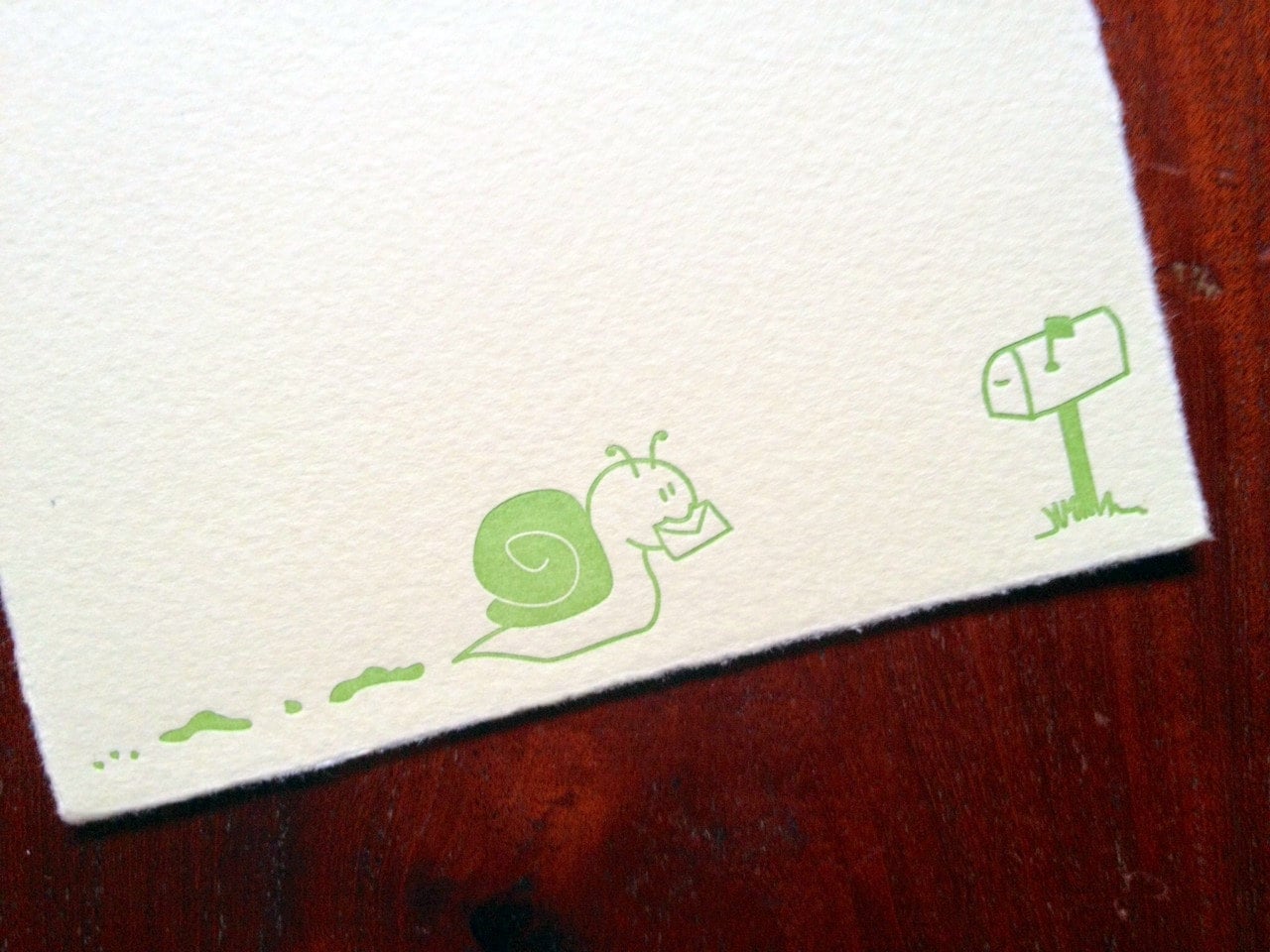
    I found out about Orange tabby press, a fantastic etsy shop, from one of PostMuse's tweets (@PostMuse). She was praising this Snail mail letterpress stationery set, and of course I fell in love with it and couldn't resist ordering some. It's a little hard to tell from the photo (though the description does say this on the etsy listing), but it's on light green paper. The paper itself is thick and of high quality, and takes fountain pen ink beautifully. I've only tried one ink on it, and in all honesty I can't even remember what ink it was right now... but it did not bleed through or show through at all, and I could write on both sides.


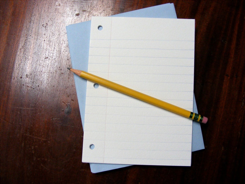
    Also from Orange Tabby Press, I got this lovely set of Letterpress notebook paper, which really does come with the pencil. I haven't tried mine out yet, though I will assuredly do so with a fountain pen and not the pencil.

    Wednesday, September 7, 2011

    Stationary vs. Stationery

    I have blogged about my peevishness over the conflation of these two words before. I have often vowed, with rare irresistible exceptions, not to purchase from vendors who don't know how to spell their own stock.

    But now I see the search results on etsy, and I wonder if I need to mistakenly tag my items with "stationary." I think more people search for "stationary" than "stationery." ARRRRGH!!

    I mean, is a postcard really meant to be stationary? I think it's meant to fly...

    Apologies for the late-night rant. I think I won't respect myself in the morning if I cave. Persnickety grammarians will agree, and the rest of you will probably think we're just fuddy-duddies. Ah well. Perhaps we are.

    Friday, June 4, 2010

    Homophone peeve

    I've almost posted about this a million times, and this morning I'm just going to fire it off: the misuse of stationary absolutely drives me batty!

    I know, it's one little letter, but I just gotta say it.

    stationery
       /ˈsteɪʃəˌnɛri/ [stey-shuh-ner-ee]
    –noun
    1. writing paper.
    2. writing materials, as pens, pencils, paper, and envelopes.


    stationary
       /ˈsteɪʃəˌnɛri/ [stey-shuh-ner-ee]
    –adjective
    1. standing still; not moving.
    2. having a fixed position; not movable.
    3. established in one place; not itinerant or migratory.
    4. remaining in the same condition or state; not changing: "The market price has remained stationary for a week."

    (Definitions and pronunciations courtesy of dictionary.com)

    Here's a fun pun:
    "No matter how you push the envelope, it's still stationery."
    But maybe that is even more confusing for some people.

    OK, that's my rant for the day... I'll leave you on a positive note, related to this homophone peeve: PostMuse is doing a very fun giveaway of a tote bag with both of these words defined.

    Update: Thanks to reader JP in CA for pointing out this fun post on the Crane blog. True 'nuff, people in the business should know how to spell their own product!

    Sunday, December 13, 2009

    Hand-painted peacock stationery

    Hand-painted peacock

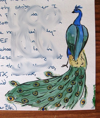
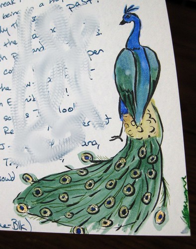
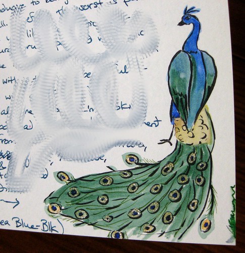
    The amazing artist over at All My Hues has done it again - she sent me this gorgeous hand-painted peacock stationery!

    Hand-painted peacock

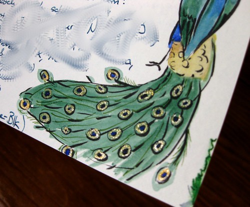
    See the gold glitter in its tail? Isn't it AWESOME??

    peacock tail glitter

    I just had to do a close-up on that glitter because I love it so much.

    Hand-painted peacock with glitter in tail

    I'm very fond of peacocks, and this is one of the finest representations I've seen. I'm so floored that it was painted just for me! She blogged about it in detail when she made it, in case you'd like to learn more about all the wonderful materials she used; I'm not an artist, but I do know she did this on Crane paper.

    I am SO honored to receive this gorgeous work of art - and she wrote a really great letter around it, too!

    Friday, August 14, 2009

    I have finally organized my stationery!!!

    Stationery organized!

    Yes, folks, this post title deserves three exclamation points.

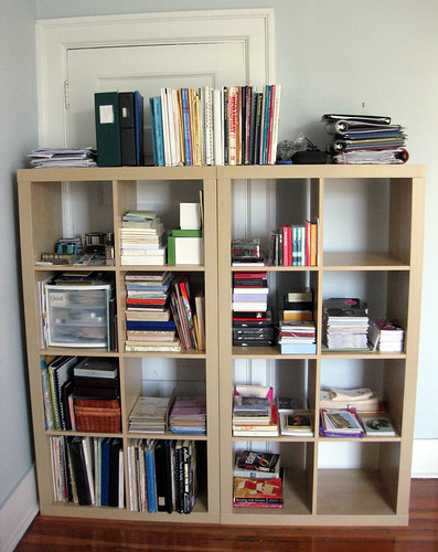
    Thanks to a trip to the lovely IKEA on Monday, I have two new sets of cutely named Expedit shelves that are now organizing the items in my study. In the past, when folks asked me how I organized my stationery, I had to admit that it was spread out in a million places all over my apartment. No more!! It's all here, folks, and I am kind of chagrined to realize how much I actually have. Good gravy. NO MORE EBAY STATIONERY FOR ME. Oy.

    (Yes, the shelves are blocking a door; we never use that door and it was already being blocked by another piece of furniture pre-reorganization, anyway.)

    Each of the cubbies has a theme, of course, which probably only makes sense to me, but you can see them all in notes on the Flickr photo. Roll your mouse over the photo to read the notes explaining each section. (Yes, I have a whole cubby dedicated to The Muppets, a whole cubby dedicated to vintage, and half a cubby just for Edward Gorey. You see where my interests lie...)

    I am way, way too excited about this. I even have two empty cubbies! (I am considering putting my letter pile in one of them, but having it in the living room, where I actually write, helps me to see it all the time and know how many letters loom.)

    The only downside is that I kind of stand in front of the shelves indecisively, wondering what the hell I'm gonna use for my next letter.

    Thursday, August 6, 2009

    G. Lalo Bordered Card Pack: Pistache / Green

    G. Lalo Bordered Card Pack: Pistache / Green

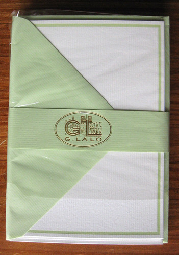
    In my continuing saga of Exaclair product sample reviews, I give you the G. Lalo Bordered Card Pack, shown here in Pistache / Green.

    G. Lalo Bordered Card Pack: Pistache / Green

    The set comes wrapped in cellophane, with the G. Lalo logo embossed in gold on the band that holds them all together so prettily.

    G. Lalo Bordered Card: Pistache / Green

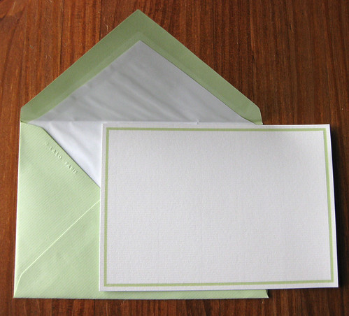
    The paper texture on the cards and envelopes is laid, or slightly textured/lined. On the cards it is straight/horizontal, and on the envelopes it has a lovely diagonal slant. The envelopes are lined with nice, crinkly white tissue liner.

    Although I am a big fan of green, I don't tend to like pastels, and this one seems to have a lot of orange/brown undertones with a kind of washed-out feel. Would I have chosen this off the shelf? No. But it's still an enjoyable experience to write a note on it. Actually, contemplating the color... for you ink-nuts out there, perhaps the new Noodler's V-mail GI Green would be a match. I hear it has some funky orange undertones and edges to it. (Sorry, inside ink joke there for those of us that follow new Noodler's inks and their funky behaviors... maybe just a bit too closely.)

    G. Lalo Bordered Card: Pistache / Green

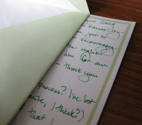
    Of course how it behaves with fountain pen ink is one of my primary considerations, so here you can see a closeup (and if you want even closer, view large). I used a Sheaffer Agio fountain pen with a fine nib, carrying Noodler's Hunter Green ink. This ink doesn't exactly harmonize with the shade of green on the border, but oh well. At least the ink is waterproof. It behaved beautifully on the paper - quick drying, no hint of feathering.

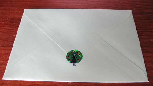
    G. Lalo Bordered Card + peacock

    The envelopes are so elegant and beautiful - thick and weighty, but not too much so - that they hardly need anything else... but this peacock wanted to go along for the ride.

    Though there was no price on this pack of cards, my research direct from the Exaclair website indicates these retail for $13 and come in packs of 10. (You can purchase them at Distinctive Stationery.) I am generally loathe to pay more than $1 per card unless it's something spectacular, and this is a little too understated for my definition of spectacular, so I probably wouldn't buy them. But, they're still lovely and I'll enjoy using them.

    Friday, July 24, 2009

    Exaclair samples, many reviews coming

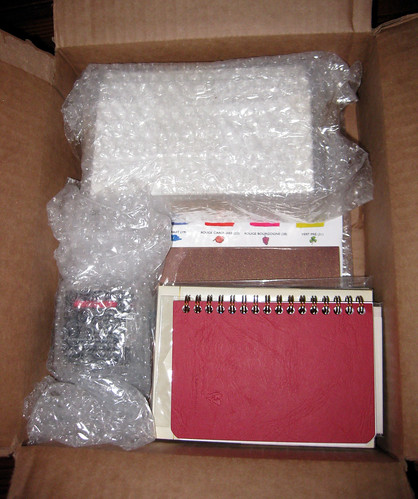
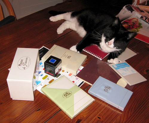
    Exaclair box-o-goodies

    The Bastille Day offer on the Quo Vadis blog, an opportunity for their blog readers to request and sample any red or blue J. Herbin fountain pen ink, seems generous, oui? So I said, what the heck, I'll probably never buy one but I'm up for sampling the Eclat de Saphir blue ink, after it looked so nice in Biffybeans' review back in October. (I've seen it in a few letters, too, and thought the color looked pretty groovy.) The very generous Karen at Exaclair offered to put together a nice package for me including some papers to review, since they were sending me the ink anyway. She even asked for, and honored, my color preferences - waaaay cool. But man, I didn't expect such a boon in a box! I am not going to do the math on this, but this is a lot of money's worth in some very fine stationery.

    As you probably know if you've been reading my blog for a while, or reading my letters, I am already a big fan of Clairefontaine and G. Lalo papers. Good stuff. But Karen did a fantastic job of sending me some of their products that I haven't tried before.

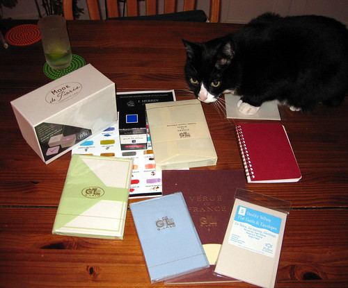
    As the lovely Miss Soda must be present for any unpacking of a glorious cardboard box, she joined the photo shoot to help display these products. (I can't help noting that her loveliness is sitting next to my hands, just in front of my keyboard, purring melodiously as I type. I love this cat.)

    Soda inspects Exaclair samples

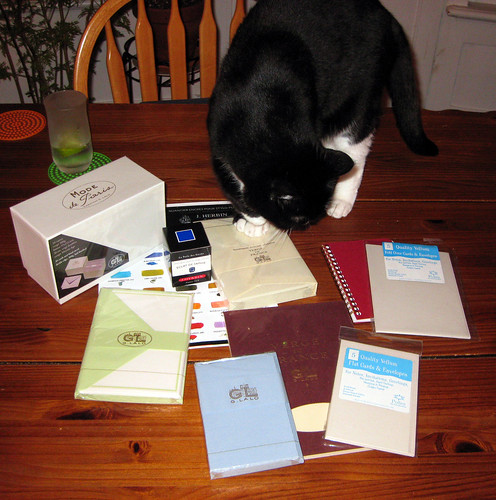
    I promise, when I actually review each of these items individually, I will get their names right and provide full links. For the time being, I'll tell you that from Clairefontaine we have some Pollen stationery in grey, in two sizes (a larger notecard and a smaller flat card), and a little red wire-bound spiral notebook. From J. Herbin there is the promised Eclat de Saphir blue fountain pen ink. From G. Lalo, a tablet of Verge de France paper in ivory with matching lined envelopes (the cover of this tablet is what is glittering gold in the top photo of the items still packaged in a box - cooool; I capture glitter totally inadvertently), Mode de Paris boxed flat cards, small blue flat cards with lined envelopes, and green-bordered flat cards with green envelopes.

    Exaclair goodies: the Soda test

    Now I'm just shamelessly showing you more photos from different angles, just to show off how cute Soda is when she inspects my new stationery items. (Oh yes - that's my happy gin and tonic in the corner.)

    Exaclair samples: Soda approves

    It's official: Soda approves. (That's her "I'm so happy I'm purring with my eyes closed" smile, which is kind of freaky in photos because it makes her eyes look like they disappear.)

    Stay tuned - each of these fine stationery products will get a review in the coming weeks. I'll give a spoiler already and say I'm liking the Eclat de Saphir a lot better than I expected.

    Wednesday, June 17, 2009

    Morning Fairy cards

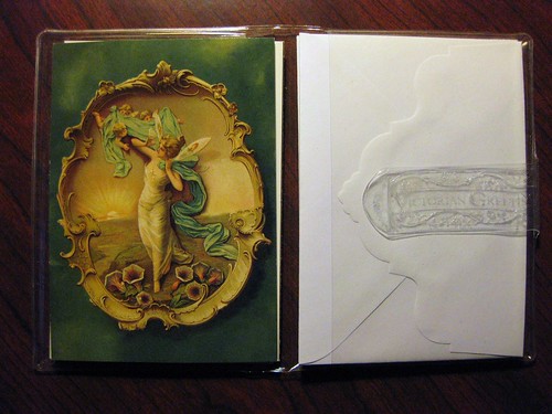
    Morning fairy cards

    The Victorian Papers outlet store in Kansas City yields many gems and surprises. These Morning Fairy cards, with artwork derived from a 19th century Fairy Soap advertisement, were on a rack there. I've never seen these cards in their store or their catalog, and I've been frequenting their store and browsing their catalogs for nearly 20 years now. I was delighted to find this surprise.

    I am actually a big fan of fairies, but don't like the cheesy kind - I'm picky about my fairies - and I'm kind of surprised I haven't blogged about fairy cards or stationery before.

    One of my favorite things about the small 3.5x5 Victorian Papers cards is the die-cut envelopes with the beautiful back flap, which I hope this photograph captures.

    I wasn't able to successfully photograph the back of the card, which has printed Lord Byron's "She walks in beauty, like the night" poem.

    Wednesday, May 6, 2009

    International Girl aerogrammes: my latest fancy

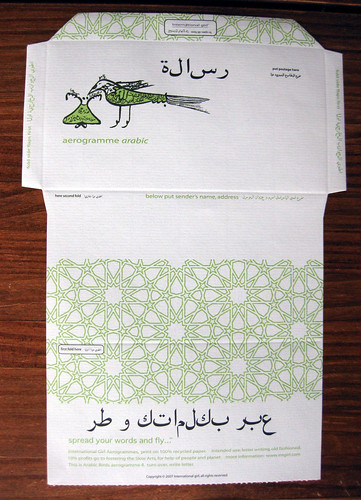
    Arabic birds aerogramme outside before folding

    I warn you all, I'm going to kvell about these International Girl aerogrammes for quite a while, with a lot of photos here and probably more in the future. These things are AWESOME.

    Really do check out their website, because before I get into all the practical considerations of why they're great stuff, I should mention how much I support their mission. (Yeah, they're a little on the pricey side. I debated for a while, and had to wait for the appropriate time in the budget to buy them.) In the "our cause" section of their website, they note how not only does the aerogramme "celebrate the timeless art of letter writing," they go on to state most eloquently how each design has an international theme "with the aim of increasing awareness of different languages and cultures across the globe." Of course they're environmentally friendly, being 100% recycled (a little more on that in a moment), but the part that really gets me is that they are created in support of The Slow Arts, an approach to life. "We believe that happiness and kindness come through slowing down and taking time: savoring the moment and being aware." Hear, hear! That is so much a reason why I write letters, and maybe why we all write letters.

    But on to the practical with more pretty pictures. You can see what the inside writing space of the aerogramme looks like in yesterday's post. The top photo of today is the aerogramme design side, before folding into an envelope.

    (For those of you who are wondering, the International Girl site offers a great explanation of "What is an aerogramme?": "a letter that folds up into its own envelope.")

    Arabic birds aerogramme, folded back

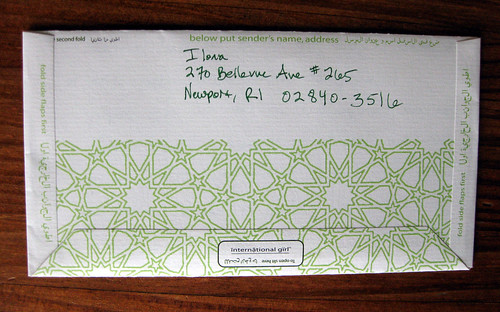
    Here we have the back, once it's folded, with a space for return address. I assume the arabic writing says the same.

    Arabic birds aerogramme, folded front

    That's the front, with the pretty design. I used a kind of weirdo Star Wars stamp, but don't let that mar the overall beauty.

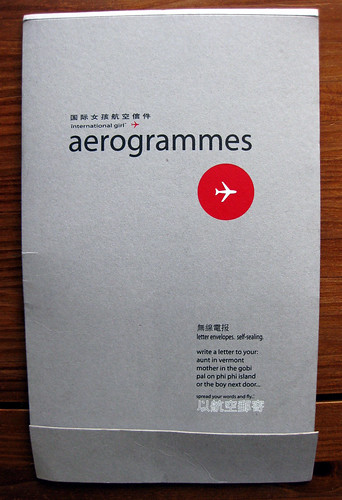
    International girl aerogrammes packaging

    Here's the pretty packaging - all the aerogrammes are in a tablet inside, and you tear them out one by one.

    Spread your words and fly

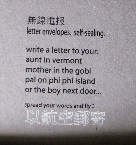
    I love this so much: writing suggestions. Tee hee. Their slogan is "spread your words and fly." Delightful.

    Okay, this is a long post, so thanks to those of you serious readers who've hung in there with me. My big concern when I bought these was how they would hold up to fountain pens and fountain pen ink, because I prefer to write all my letters with fountain pens (unless they're on black paper, and then I'll reach for the metallic gel pens). I was a little worried about the high recycled content, because that often means there will be a lot of feathering and bleed-through. However, these have been a fantastic surprise in that they take fountain pen ink beautifully. The top photo was taken AFTER the letter had already been written on the other side - clearly no bleed-through at all, and you can see for yourself that there's no feathering on the ink. (That green ink is Noodler's Eternal Hunter Green, for those who are wondering.) The paper has a lovely feel, with a little bit of a laid surface, but it takes even my extra-fine Japanese nibs without any feedback, AND the ink dries very quickly on it. This has become some of my favorite letter-writing paper in its own right.

    I also have the Chinese sun and clouds design, which is just as lovely, so I'm sure to feature some photos of that in future posts. (It is lined with a fairly narrow rule, while these of the Arabic Birds are blank/unlined.)

    If you're looking for some great letter-writing stationery that supports a good cause, I just can't recommend this highly enough.

    One question remains: why is the company called "International Girl?" My inner feminist digs the concept, but it does seem a bit mysterious.

    9 May 2009 UPDATE: if you read the comments below, you'll see info from Jaki of the International Girl Aerogrammes, and she gives an explanation for why they're called International Girl and a confirmation that indeed the translations in other languages are exact, and some more fun back story on the company. Thanks, Jaki!

    Saturday, May 2, 2009

    My G. Lalo binge: a French paper extravaganza

    Package of paper

    You've probably heard me bemoan my stationery-buying habit. It's a bit of a problem, and I am quite the hoarder. Combine this tendency with a really fantastic sale on high-quality papers I love, and that gets me a ginormous box of paper. Woo hoo!

    I've just discovered Distinctive Stationery. How did I discover them? I can't even remember if it was a google search or if someone on the Fountain Pen Network recommended them. But they're having a big sale right now, folks, and I did succumb. Oh yes, I did.

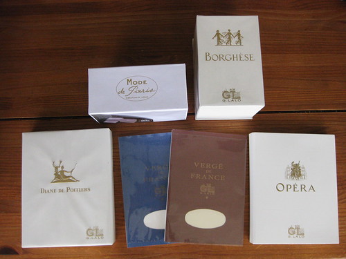
    They carry some Crane's, and I am pretty well set on that so I was able to resist, but I gave in to their selection of G. Lalo papers. Zowie. Here's my haul:

    G. Lalo binge

    All of these were right around 50% off, which is a fantastic deal. I always have some of the Verge de France tablets around; they make excellent second (or third, or fourth, etc) sheets in letters when I'm using my beloved fold-and-mails or decorative paper/envelope combinations. I had never tried the others, though, because I found them just too too expensive. Half price, though, I can swing. The Opera and Diane de Poitiers papers seem very much like the white or ivory Verge de France tablet sheets, except they're a slightly different size and they have deckled (kind of a pattern-cut) edges. One of these days (yeah, yeah, I know) I'll take a photo of those. The envelopes are really lovely, also with the pattern-cut flap and lined with crinkly tissue paper. The Borghese and Mode de Paris are heavier flat cards, and smaller. Writing a letter on any of these babies feels positively luxurious. I'm sure you'll all be seeing some of these wares in your mailbox from me at some point.

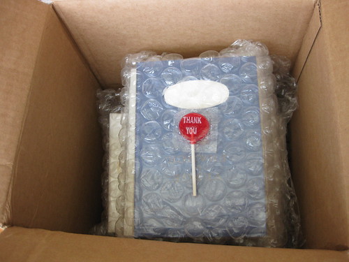
    I will again plug the big sale, AKA the Clearance Closet, at Distinctive Sationery, for anyone looking for some fine papers. Their packaging, as seen above (they bubble-wrap PAPER??), is very secure, and these arrived extremely quickly. I'm satisfied with the service AND the prices.

    Just for fun and for the curious, here's a little bit more about G. Lalo.

    Guess I'd better go dig into that letter pile now and write me some letters!

    Sunday, March 29, 2009

    The day I wrote 9 letters

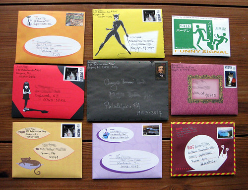
    9 letters heading out

    I do write a lot of letters, but 9 heading out on one day is prolific even for me. This is what I did with my spring break.

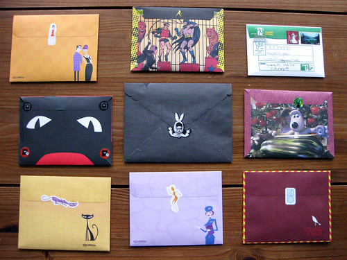
    9 letters, the backs

    These babies all headed out on March 19, so yeah, I'm behind on this happy blog... but I think it's apropo of the timing of snail mail... you just gotta wait for it, and that's part of the joy. Plus, these letters have already arrived by now (I hope!); I hate to ruin the surprise of letting recipients know exactly what their letter is going to look like before it hits their hot little hands.

    Friday, February 20, 2009

    I can't believe my luck!!
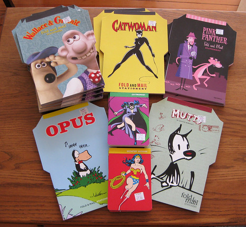
    Chronicle Books fold and mails ON SALE!!

    The other day I was wondering around in my favorite el cheapo super-discount store, when I hit the jackpot in the stationery aisle -- a whole slew of Chronicle Books fold and mails on sale! These puppies retail for at least $8, but they were only a dollar a piece. Of course I bought out most of their stock. I got 5 (FIVE, people!!) Wallace and Gromit, 2 Catwoman, 2 Pink Panther, plus an Opus and a Mutts. Zowie. I have plenty of fold and mails now! Also picked up some cute notepads, too - not Chronicle Books, unfortunately, and the paper is not as fountain-pen friendly as I'd like (just in the little notepads; the fold-and-mail paper is great for FPs), but hey - it's fun to match the Catwoman fold-and-mail with Catwoman notepaper.

    For anyone who lives in Massachusetts or Rhode Island, I found these in an Ocean State Job Lot. The various stores often have similar stock, so maybe you'll find some in a Job Lot near you!

    Wednesday, February 18, 2009

    Donovan's gorgeous Paper Doll letter

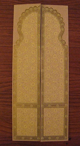
    gorgeous stationery!

    Is this snazzy or what?? It is yellow printing accented with gold leaf (or something gold and metallic).

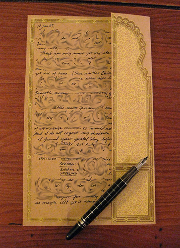
    stationery half-open with pen

    It opens up elegantly to an inside with a decorative border. (Shown here with my Baoer Skywalker fountain pen.)

    ...and, for the fountain penners among us, she wrote it with a dip pen!

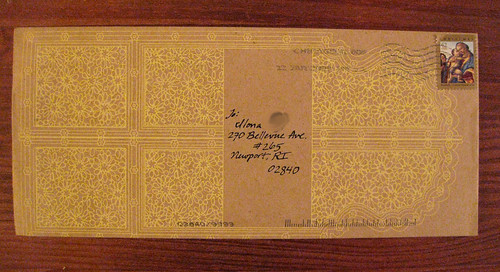
    Envelope from Paper Doll

    Even the envelope is ornate and lovely!

    This came from Donovan, who said she got it at Paper Doll in Chicago. Oh how I wish they sold this online! This stationery really blew me away.