Tuesday, March 30, 2010

Diamine ink comparison, in pens

IMG_5785crop

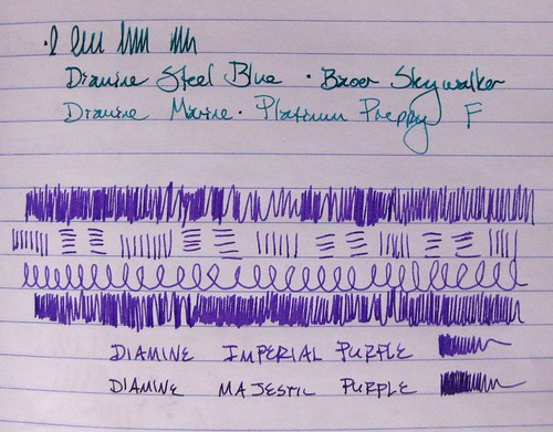
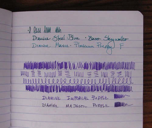
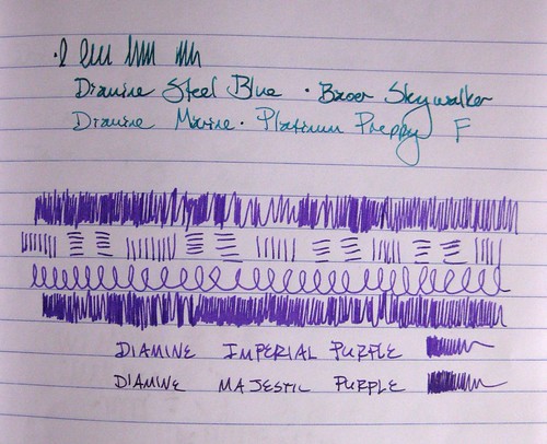
To follow up on that post I did a few days ago on the Diamine inks, here I have photos of them loaded in pens, with the two similar colors next to each other.

IMG_5788crop

The Steel Blue definitely looks darker, deeper, and with more jewel-green undertones. Of the purples, all the scribbles are with Imperial Purple. I did not note the pens for those, either, mea culpa: the Imperial Purple is in a Lamy Vista F, and the Majestic Purple is in an Esterbrook SJ with a 2550 nib.

IMG_5792crop

Yep, they're similar colors! I do like the Majestic Purple, but whenever I see it next to the Imperial Purple, I like the Imperial Purple a lot more.

IMG_5792cropNoEdit

Yes, I do a little bit of levels/color correction in my photos; just for comparison, the above photo is unedited/corrected for light and shading.

Monday, March 29, 2010

Three Pilot Iroshizuku Inks

Three Pilot Iroshizuku Ink comparisons, I

Like I said, we'll be on this fountain pen ink theme for a few posts straight, folks. Bear with me.

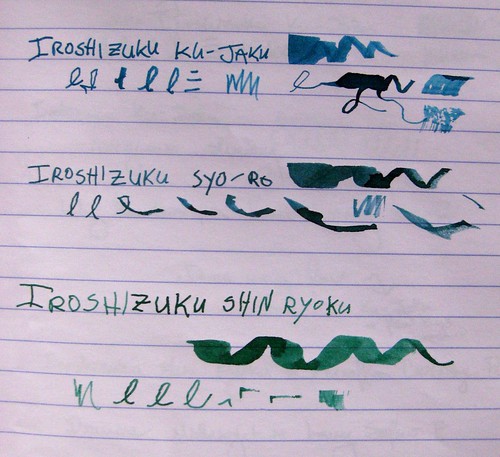
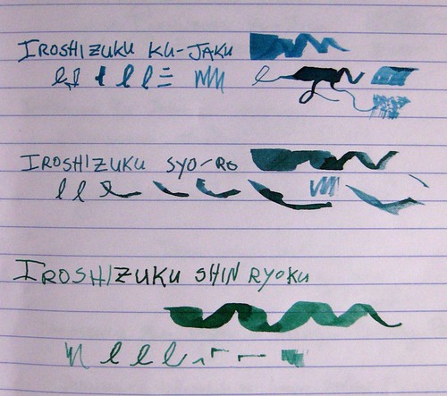
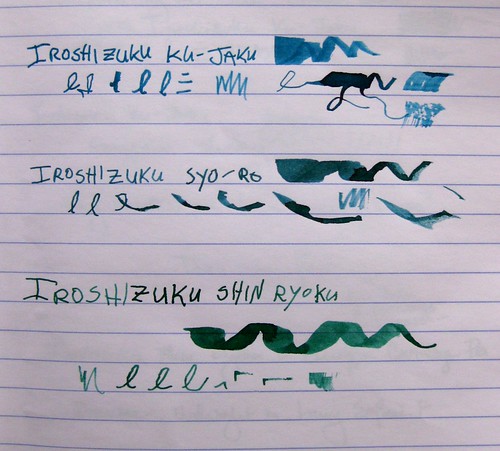
Here are three inks from the Pilot Iroshizuku series. It's a Japanese ink that is rather expensive... some folks think it's overpriced but I've found it's pretty darn fabulous. These are probably my three favorite inks right now. If you've heard me talk ink, you know I really love the fine lines between blue and green: the blue-greens, the green-blues, etc... and I love me a good, rich, dark green. So I am completely thrilled with these three.

Three Pilot Iroshizuku Ink comparisons, II

As with other ink photos, I've taken these in natural light from a variety of angles. Photographs do not do this ink justice - it has so much richness and depth, beautiful shading, and it really does look that gorgeous in a pen. I hope to have writing samples from a pen up here someday, but these are toothpick lines just like yesterday's post.

Three Pilot Iroshizuku Ink comparisons, III

These inks are starting to become more widely available in the U.S. (I can't speak for other countries, sorry, except that they come from Japan) but I bought mine from JetPens, one of the first retailers to bring them all over here. I know I've talked about JetPens before - fabulous customer service and incredible shipping rates - free with a purchase of $25 or more in the USA. Wow. Anyway, the colors I have here are as follows:

Ku-Jaku / Peacock (Deep Turquoise)
Syo-Ro / Pine Tree Dew (Dark Turquoise
Shin-Ryoku / Deep Forest Green (Deep Green)

I linked to the product pages because the bottles are so darn pretty, too. Even the boxes are gorgeous.

Most importantly, this is the best-behaved ink I have ever used. Ever. It flows perfectly, and it dries instantly. I have yet to smudge it, even from a wider nib on slick paper like Clairefontaine. Hooray! I love this ink and definitely think it's worth the heftier price tag. I still covet a couple of the other colors, particularly Tsuki-Yo (Night Sky), but those may have to wait a bit...

Sunday, March 28, 2010

Five Diamine inks

5 Diamine inks in ink journal, I

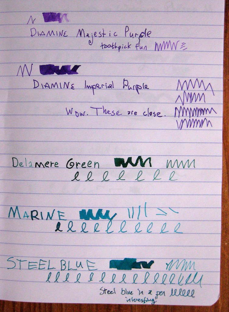
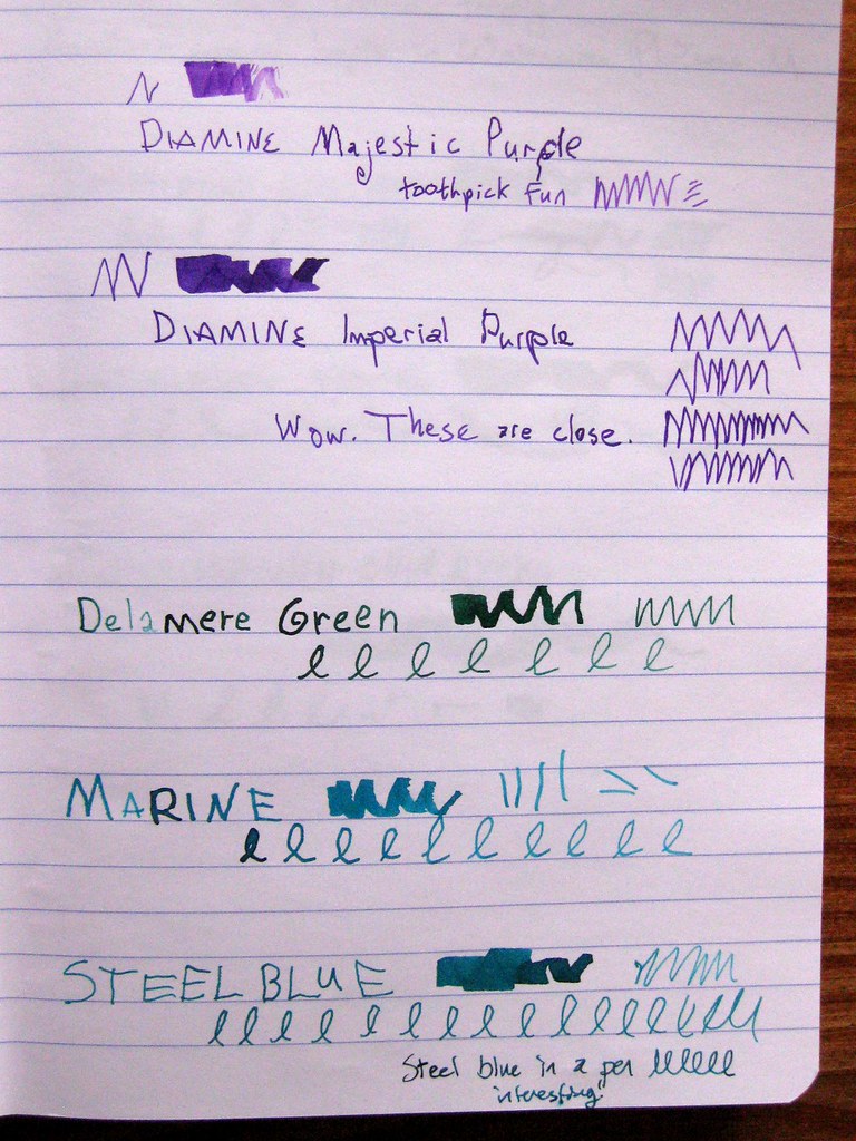
Here we have a very unscientific comparison of 5 fountain pen inks by Diamine: Majestic Purple, Imperial Purple, Delamere Green, Marine, and Steel Blue. They are done with toothpicks in the ink, except that the bottom example of Steel Blue also has a writing sample with the ink in a pen.
5 Diamine inks in ink journal, II

These samples are in my Clairefontaine ink journal, and they were taken with no flash in natural sunlight. I turned the journal three different directions on the table, so you'll see a slightly different angle for the lighting. Some people don't care, but I do - I like to see the subtleties, especially when I'm trying to make judgments on a computer screen.

5 Diamine inks in ink journal, III

Diamine is an English maker of fine fountain pen inks, and I recently purchased a whole passel of smaller 30ml bottles directly from them. Shipping from the UK wasn't all that bad, all things considered, and I like trying out the colors in the smaller bottles. I knew that I'd be getting some similar colors, and I am pretty fascinated by the results of how similar Imperial and Majestic Purple are, as well as Steel Blue and Marine.

The Delamere Green is sort of the odd duck - it's not similar to any inks on the page, but it is a gorgeous dark green with a deep hint of blue.

Warning: I'm about to get geeky about ink, so if you're a general letter-writer reader, you might not dig into this next bit. (Maybe I've lost you already.)

I am really in love with Diamine inks these days. The color variety is beautiful, the saturation is excellent, the shading is almost always pronounced and fabulous, and the behavior is near-perfect: good flow and VERY fast dry time. I've bemoaned the fact before that I am right-handed, but I write like a lefty: I'm an "overwriter" which means that I curl my hand around, and my hand sits on top of the lines I've written above. For a slow-drying ink, this means almost certain smudging unless I place a very careful blotter on top of the paper. With Diamine inks, this is almost never necessary.

In a separate post I will show off Diamine Violet, which I only got as a sample - that is the one bottle I am certain I will buy in a larger size. As for the purples, I have a slight preference for Imperial because it is more blue, and Majestic is more on the pink/magenta end.

I shall almost certainly acquire a larger bottle of Delamere Green.

Marine or Steel Blue? They are just too similar to buy both, but I'm undecided. They behave differently in pens, of course, and I'm just going to have to try them both out in different pens. So far I tend to lean towards Marine, because Steel Blue is so similar to another color I love: Private Reserve Blue Suede.

So many inks, so little time...
Saturday, March 27, 2010

Fountain Pen ink samples

ink samples

Those of my readers who are not fountain pen users may want to sit tight for a while, because I do believe my next few posts will be about ink. Fountain pen ink, that is.

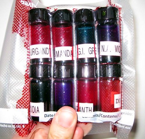
Behold the fantastic ink sampler from Pear Tree Pens. It is a rather brilliant business idea they have - offer teeny tiny samples of bottled ink for a low price. It's a great way for folks to try out a new ink color without buying a whole bottle of the stuff... and if you've played around with fountain pen inks at all, you have discovered that the way it looks on a computer screen is not necessarily the way it's going to look in real life. (In fact, it's gonna look different flowing out of different pens, on different papers! Ah, variety...)

vacuum packed and leak-safe

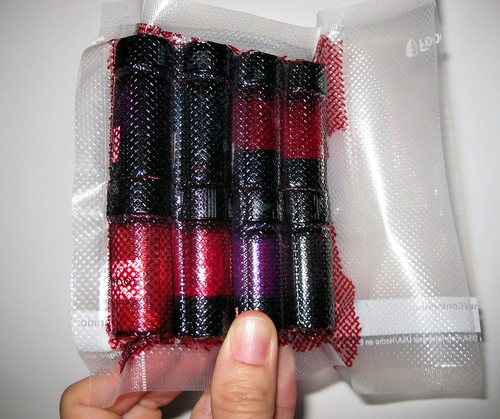
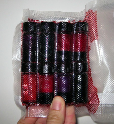
So here you see my latest purchase - two samplers, which means 8 tiny bottles of ink. They are safely vacuum-packed, which is a good thing, because one of the bottles leaked, and this kept things from being too messy, as you can see from the contained leakage in the photos.

Leaky Lou

In fact, the bottled that had leaked was completely gone and unusable, and Pear Tree Pens showed their typical stellar customer service - they sent me a replacement bottle at no charge, and even threw in three extra samples for free. So I essentially got almost three samplers for the price of two. Thanks, guys!

ink samples, leaked

You can probably also see that you don't get much ink in these samples, so don't expect to fill a big pen that's a piston filler... but I often use a syringe (also from Pear Tree Pens, a la their fabulous Write Fill Cartridge/Converter Fill Kit) and so I can easily test out the ink that way... and I can generally fill a converter or two from the sample bottles also.

I was searching for that perfect shade of burgundy/maroon ink, which I did not find in this sampler or anything else they sent as a follow-up (I am so irked by pinkish burgundies, they are just not for me); I have since discovered that I can achieve a very pleasing burgundy by mixing inks I already have (hooray!), but in this sampler I also learned that I simply MUST have a bottle of Diamine Violet soon.

Friday, March 26, 2010

snaily mail

mail snails

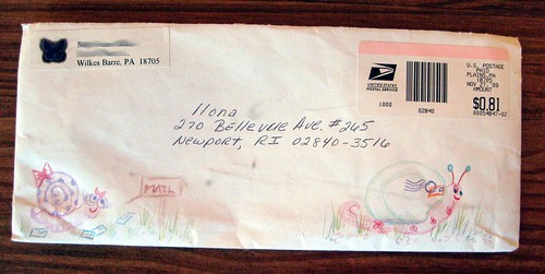
Quite a while back I did a swap on Swap-bot called "Snail Mail :]." I blogged about my own offerings at the time, but did end up responding to one of the swapped envelopes I got.

big snails on the back

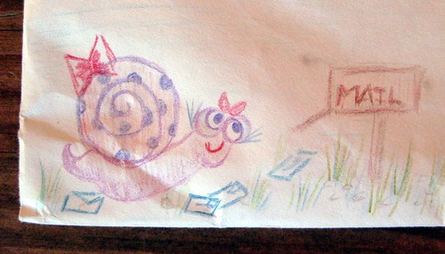
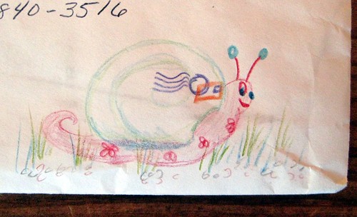
The idea was to decorate the envelope with many snails, and I was really touched by the hand-drawn snails on this one.

mailbox snail

She obviously put some time into her snaily drawings...

mailing snail

...and I found them delightful.

Thursday, March 25, 2010

Mork from Ork vintage postalette

Mork and Mindy postalette

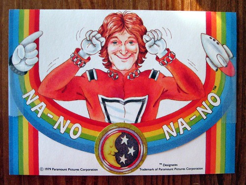
This gem came from a fabulous eBay find (ah, eBay, you are my budgetary downfall): a mint condition, NIB (new in box) set of Mork from Ork rainbow postalettes, from the show Mork & Mindy.

Yes, folks, I remember watching Mork & Mindy as a child - I adored that TV show, and it gave me a lifelong admiration for Robin Williams. This postalette shows Robin Williams in his Mork role, wearing his space suit, and the words are his catch phrase. I'm stumped by the spelling, though, because I recall it sounded like "na-noo" and not na-no. Oh well, discrepancies aside, they're fabulous. The moon and stars sticker came with the original set to seal the postalette, but I gave it a little help with some removable tape.

vintage rainbow Mork and Mindy postalette

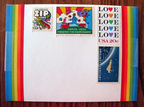
As if these weren't awesome enough, they're covered with rainbows! The rainbow element wraps around the front, on the address side. This one deserved some very cool stamps, so I tried to go with either the rainbow theme or a space theme, to complement the postalette itself. These are some of my very favorite stamps, too. On the left is the "It all depends on ZIP CODE" mail transportation stamp (of course I love the meta mail theme, but the rainbow puffy artwork is delish), in the middle is the Expo 74/Preserve the Environment stamp with artwork by Peter Max, and on the right is the Love stamp with hearts forming the Os in rainbow colors. The Project Mercury stamp is my nod to the space theme.

This was a fun postalette to send and construct; so far I've only sent the one, but I think I've got 11 left. Hmm...

Wednesday, March 24, 2010

March Madness goal reached!

Remember my little March Madness goal to write 100 pieces of mail by April? I just did it! The 100th piece is freshly completed and addressed.

I'm thrilled to have reached my goal in less than 5 weeks - almost a whole week early by the April 1 deadline - and I'm going to go ahead and track the stats until April 1 just for the heck of it. Just for posterity's sake, the stats as of this moment are 63 letters and 37 postcards.

Just had to share the fun news!

(Don't ask me to count the items in my letter pile, though, OK? Because I've probably received just as many as I've written this month...)

Another Muppets postcard

Muppets postcard

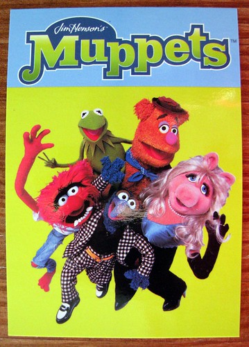
I figured that Sesame Street artwork postcard deserved some Muppets in return, so this is what I sent in response.

Oh, how I adore Muppet postcards...