
Dear blog readers, I need your help! I have two different designs of new postman stickers I will soon be selling in my etsy shop, and I really need feedback on which design folks prefer.
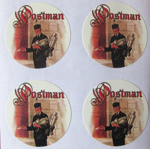
Above is design 1. It is a longer shot of the postman, and shows only his torso and includes the ornate "Postman" script in red on the top.
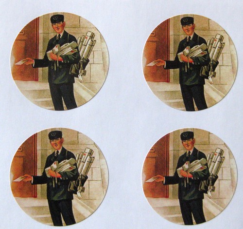
And here we have design 2. It is a closer crop on our friendly postman, but no words.
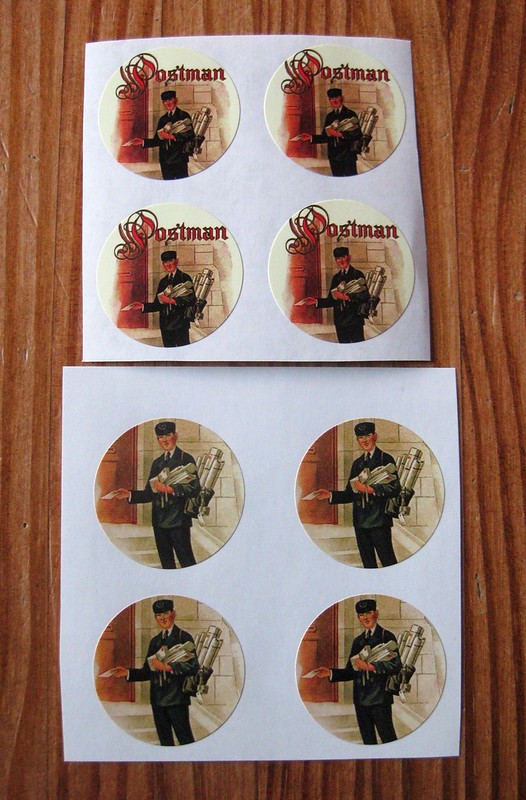
Incidentally, both are exactly the same size, though one of them has the stickers set a little closer together. Don't let that sway your decision - I'm only lookin for which sticker design people like better. Would you comment or convo me on etsy and let me know which design you prefer? Thanks in advance for your feedback, I really appreciate it!