Showing posts sorted by date for query JetPens. Sort by relevance Show all posts

Thursday, March 26, 2015

Writing desk candid + washi tape storage

WritingDesk2015March15

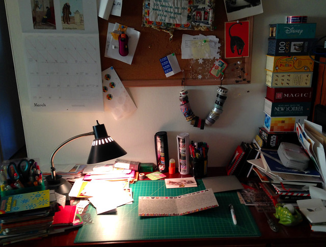
Well, I haven't done such a good job of blogging again this month, have I? The good news is that I've been spending a ton of time writing postcards and longer letters, which has been a pleasure. I took a photo in the middle of writing one of those longer letters recently, just to share the mood of my writing desk. I didn't really tidy it for this, so you can see the current semi-mess in action, complete with messy piles.

I didn't set out to talk about this, but as I look at the photo, I'd like to mention my new storage system for washi tape. I mention this in part because I've been really, really into washi tape especially lately, and my collection has grown... thereby increasing my need for a decent storage system. I like to use the tape outside of a dispenser and place it by hand, and I also need to be able to see all my tapes at once. You can see some of them hanging from my bulletin board on a system I've rigged with hanging them on a ribbon between two pushpins; this is nice for visibility, but a bit of a pain for retrieving the tape unless they're the ones on the end. So, the ones I use less frequently gravitate to the middle.

The new system about which I'm most excited is a little less apparent here, but you can see it under and to the left of the hanging tape rolls, next to the mug of fountain pens. They are Mark's Round Pen Cases which I got from the beloved JetPens. Yes, they are technically pen cases, but when I saw these recently added to the JetPens website, the description mentioned storage for decorative tapes, and I thought.... hmmmm.... First I bought the black case, and then I loved it so much I bought another one in white. The round shape perfectly holds the washi tape, and the clear window lets you see what's inside, and it's easy to retrieve the tapes in the middle. Now my favorite, most-used tapes live in the Mark's Round Pen Cases for fast and easy access. As you can see in the photo, they stand up nicely on their own (though they could be hung quite easily using the zipper ring), and if I need to expand, I'll get them in different colors to differentiate. They also feel very sturdy, and would stand up well to travel, I think.

You can see some of my washi tape use on the letter on the desk. I have more ideas for blog posts than I'm sure I will ever execute, but this makes me think I should review some of the utterly adorable tapes I've found recently; the designs available have exploded exponentially in the past few years, and it's pretty amazing what you can find on a tape now.

If you have any nice writing desk photos, or washi tape storage ideas, or any other thoughts, please share in the comments!

Monday, December 17, 2012

About the fabulous Platinum Preppy fountain pen, and the eydropper conversion thereof

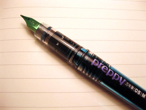
Platinum Preppy fountain pens, eyedroppers and with converter

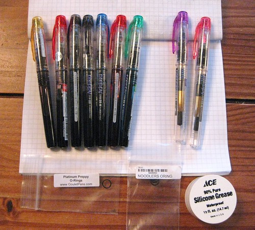
A blog reader recently spotted a Platinum Preppy fountain pen in one of my recent blog posts, and asked how I "filled the barrel completely." That practice is called an eyedropper conversion (when you completely fill the barrel of a pen with ink, and then just screw it shut, that's called an eyedropper pen, because you used to fill with an eyedropper), and Platinum Preppies are famous for this. I love 'em. You can see the difference in ink capacity in the photo above - the 7 pens on the left are all eyedroppers, with nearly the entire barrel full of ink, whereas the 2 pens on the right are using Platinum converters, which hold only a scant fraction ink in comparison.

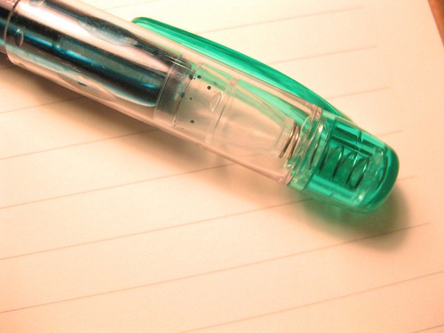
Platinum Preppy fountain pen cap - see the inner plastic cap?

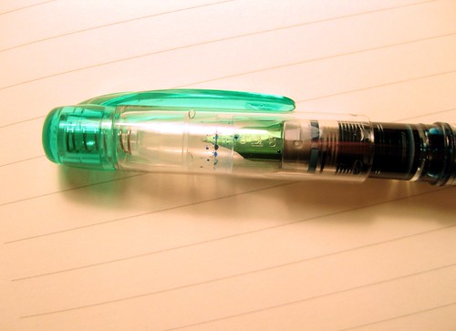
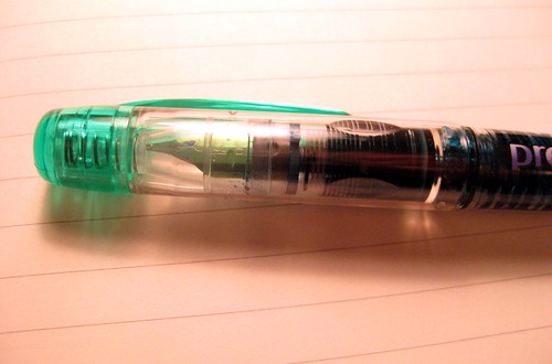
I have no fewer than 7 (actually I have 10, I missed a few in my last count!) eyedropper Preppies going at once; that is my current favorite fountain pen option. They write beautifully, they hold a ton of ink, and the Preppies have some thingamajiggy device (that's a technical term, folks) that is spring-loaded inside the cap so that it makes them extremely airtight, and therefore unlikely to dry up for months. You can see a close-up of it above.

Platinum Preppy fountain pen - awesome cap

You can see above how when the pen cap is closed, the nib pushes it tight inside the end of the cap. That special inner airtight cap thingamajiggy is a handy thing for me, since - I confess - I do often neglect my pens. I can manage not to write with one of these pens for months (it's happened), and then when I pick up the pen again, the ink is not evaporated or dried up at all. Love it. But I digress - let's get back to the eyedropper info.

Iroshizuku Shin-Ryoku ink in Platinum Preppy eyedropper

If you are at all a pen or ink geek like me, you may think it's pretty cool to see that ink sloshing around in the clear pen barrel like that. The ink in this pen is Iroshizuku Shin-Ryoku, a lovely deep green with quite a lot of blue in it.

So, an eyedropper conversion is very easy to do properly, and there are tons of online resources to get you through it... even those of you that, like me, are loathe to undertake any fancy pen modifications.

My favorite two articles are from JetPens and Goulet Pens (which are, incidentally, two of my favorite online retailers for all of my pen and ink needs). The JetPens article, "How to do an Eyedropper Pen Conversion, shows a really nice tutorial using a series of photos. I prefer step-by-step photos, because my internet connection does not always allow me to stream videos very successfully. Goulet pens has a tutorial, "Converting a Platinum Preppy to an eyedropper pen," and theirs has both photos and a how-to video. Both Jetpens and Goulet Pens sell the supplies (o-rings, and maybe silicone grease) to do the eyedropper conversion, which is extremely easy and no-fuss. I do recommend using the silicone grease. JetPens calls it optional, but I consider it pretty much essential.

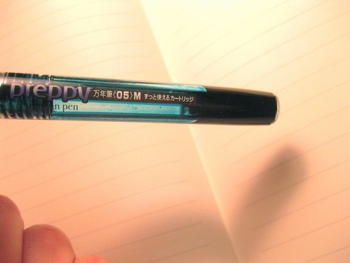
Platinum Preppy eyedropper - see the o-ring?

I have done countless Platinum Preppy eyedropper conversions, and only ever had one leak on me. The reason it leaked was because I screwed it closed too tightly and cracked the barrel. Platinum Preppies are very well-made pens, but they are inexpensive, and the plastic isn't perfect. When you have a rubbery o-ring in there, there's a lot of "give" when tightening the barrel. I thought, the tighter the better, but that is not the case. It's a little counterintuitive for me NOT to screw the eyedropper pen full of ink as tight as possible, but lesson learned; I close them gently now, and haven't had a cracked barrel since.

Platinum Preppy pen cap, posted

As the name implies, the first eyedropper fountain pens were filled with eyedroppers. There are some inks that come in bottles with eyedropper tops, and those are handy - but some people use a syringe to fill their pens. I use disposable plastic pipettes, which can be found all over the place (I get mine on eBay), and I know they are not terribly sustainable, but plastic pipettes keep your ink safer from contamination than a syringe would do. They are also faster, and require no cleaning because you just throw the darn things away. Granted, you have to be quite the intense fountain pen and ink geek in order to have a supply of plastic pipettes on hand, but... we all have our quirky hobbies.

My thorough blog reader also asked about air travel and these pens, which is a wise question indeed. The major advantage of an eyedropper pen, especially one with a large barrel like the Preppy, is that it holds tons of ink and lasts for ages. The disadvantage is that it is very susceptible to heat and air pressure. If the ink is very low in the barrel, the heat of your hand itself will make the ink "blort" (another technical term, folks) and flow out of the pen too quickly. On airplanes, they can also spit out some ink. This is very easily handled. When I fly with fountain pens (and I always take pens with me when I travel, so I should just say "when I fly"), I wrap them all in a paper towel or two inside a plastic ziplock baggie. Most of the time, there are no leaks. If there is a leak, the paper towel inside the baggie absorbs the excess ink, and the plastic baggie keeps it from making a mess on anything else in my bag. The one time I had a Preppy leak fantastically on a trip, it was a little messy when I opened the bag to clean off the pens, but since the bag was clear, I knew what I was in for. (It was also my own fault, sort of - I should have known better than to fly with the ink level so low, and therefore more susceptible to changes in pressure.)

If I've made you all excited to get some Platinum Preppies of your very own, you can get them at JetPens or at Goulet Pens, along with eyedropper conversion options from either site. In the top photo on this post, you can see the little baggies of o-rings I've purchased from both Goulet Pens and Jetpens. I always have extra supplies on hand, so I can throw together an eyedropper conversion whenever the whim strikes me. [UPDATE: It seems JetPens no longer sells o-rings. You can get o-rings from Goulet Pens.]

Happy writing!

Wednesday, January 4, 2012

2011: a year in mail

Letter logs for 2011

I've been wanting to do this for ages now, and the start of a new year seems the perfect time to do it, so hear ye, read ye: I give you one heck of a massive blog post chock full of information on exactly how I keep my correspondence records, complete with monthly and yearly statistics at the end. (Beware, this may be a frightening glimpse into my quirky depths. But isn't that why we all read blogs anyway?)

Every day I record my mail, both incoming and outgoing. I haven't settled on a good name for the books yet; I refer to them as letter journals, mail logs, correspondence records, letter logs, and mailbooks, depending on my mood. I have come to favor the small lined Rhodia Webnotebooks for this task, for a variety of reasons: they're the perfect size for my needs, the paper takes fountain pen ink beautifully, they travel well, I like the weight and color... I could go on and on. Sometimes I think about switching it up, but for now I like this habit. Also, the month/year labels just fit on them so darn nicely.

I just started a new one recently, and I average about 4 months of mail per book. (I recommend Rhodia Webnotebooks from Goulet Pens and Jetpens; they do not endorse or sponsor me in any way, I am just a very satisfied customer of both fine online retailers.)

I record incoming and outgoing mail separately. For incoming, I do all the day's mail (or multiple days, if I've been away or - gasp! - so busy I can't make it to the mailbox) in one sitting, logging it as I read it. All received mail gets recorded with a Pilot Varsity disposable fountain pen, refilled with Noodler's Heart of Darkness (black, black, very black and permanent) ink. Outgoing letters get logged as they're written, using the last color ink I used for the letter.
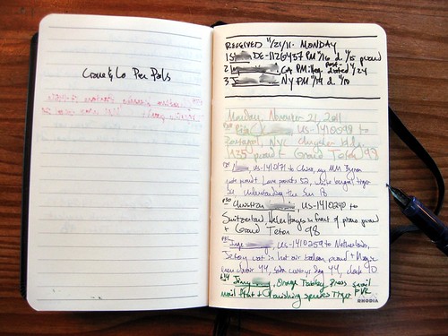
Letter journal / mail log

Here's a fair sample page with personal information blurred out. In the received section, I note the sender, location/US state or country (with Postcrossing ID if applicable; other notes, like swaps or misc info like background on the sender, I list on the facing page), postmark date or note illegible, item date or note undated, and postcards get listed first and noted as postcards.

A while back, I started satisfying some of my own curiosity with statistics. Nothing mathematically fancy here, just plain counting. It greatly facilitates my own tallies if I designate letters and postcards numerically by month. I did this all through 2011 for sent items by month, and it made counting the entire year's output exponentially simpler. In 2012 I shall do this for received items as well. That is what the designations before each entry, such as P29 or L14, mean. On this page, P29 is the 29th postcard and L14 is the 14th letter written in November. (One little statistical note, now that my etsy shop is a year old, too: although I write a note with every etsy order, I do not tally those in statistics or log them in my mailbook. They are not personal correspondence.)

So today I went through and counted them all manually. At times like this I wish I kept a fancier spreadsheet; it would be handy or at least interesting, for example, to find out how many things I sent domestically vs to foreign countries (that info is in my written records but I didn't tally it for this), or, perhaps more daunting, exactly how much money I spent on postage in a year. But I really enjoy the ritual of writing in a notebook filled with quality paper, using fountain pens or other fun writing instruments. It's a part of the process that I enjoy, and I would not enjoy keeping a spreadsheet nearly so much.

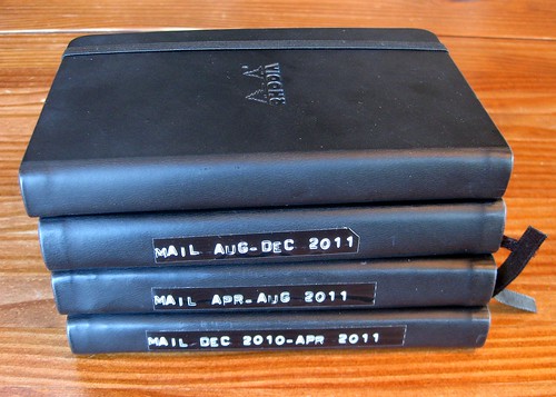
4 Rhodia Webbies: correspondence journals for 2011

Enough nattering. Here are the numbers by month. Because I noted letters and postcards separately as I sent them, but not received them, they are broken out thusly as follows:

January 2011
Sent: 39 letters, 48 postcards = 87
Received: 71

February 2011
Sent: 37 letters, 39 postcards = 76
Received: 69

March 2011
Sent: 32 letters, 56 postcards = 88
Received: 74

April 2011
Sent: 39 letters, 56 postcards = 95
Received: 83

May 2011
Sent: 20 letters, 46 postcards = 66
Received: 88

June 2011
Sent: 48 letters, 104 postcards = 152
Received: 120

July 2011
Sent: 36 letters, 83 postcards = 119
Received: 126

August 2011
Sent: 32 letters, 75 postcards = 107
Received: 147

September 2011
Sent: 18 letters, 45 postcards = 63
Received: 92

October 2011
Sent: 12 letters, 50 postcards = 62
Received: 89

November 2011
Sent: 20 letters, 51 postcards = 71
Received: 53

December 2011
Sent: 44 letters, 41 postcards = 85
Received: 69

SENT TOTAL: 377 letters, 694 postcards / 1071 total
RECEIVED TOTAL: 1081
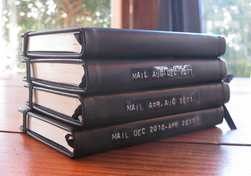
Letter journals for 2011

Postcrossing is also great about emailing monthly and yearly stats. I am not including those numbers in the monthly totals, because Postcrossing doesn't count a postcards as "sent" until it is registered, and it could be registered a month or even two after I sent it. But the yearly totals are fun, so I'll note that of the totals listed above, 326 of the sent items and 333 of the received items were Postcrossing postcards.

If you'll permit me some more characters (in an already lengthy post) of reflection, I have to note that I'm fairly cheered that my sent total is only slightly behind my received for the year. I am many months behind in responding to mail I've received, and I dare not even count the numbers in my current "needs response" (NR) pile, but the total of letters and postcards in that daunting NR pile always seems to hover around 100 or so, dating back for those many months. I don't stay on top of it by any means (obviously!), but I try to keep up a steady stream. And an average of nearly 3 mail items sent per day, with at least one of them a letter, is pretty respectable for me and my crazy schedule; it's what I'd hoped I'd achieved, and I'm pleased and proud that I have managed it. You can tell a lot about my schedule by the month's outgoing tallies; I'm a bit surprised, though, because I always feel the busiest in the winter months, but the lowest outgoing months were actually September, October, and May. Those are also busy months for me, and this year was especially skewed since I got very sick in October and did far less mail than usual that month.

2011: a year in mail

Blah, blah, blah. Numbers are fun, but I hope I can maintain some credibility, after spouting all those figures, when I attest that the spirit of my postal journey is far more about quality than quantity. Postcards do tend to be quicker than letters, but for those items contained in an envelope, I may spend 10 minutes on one or I may spend 6 hours. At the end of the day and the end of the year, I am very happy with the year in mail for 2011. I wish I weren't so behind, but I've been behind for two years now and I doubt I'll catch up anytime soon, so I've given up worrying about that too much.

I'll also err on the side of being a little preachy and note that the months of and following my most productive send numbers were also the richest in received numbers. Here you go, folks, numerical proof: to get a letter, send a letter!
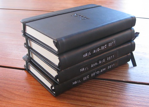
2011: the mail logs

This post has become more loquacious than I ever intended, but I guess some of my favorite posts end up that way. Thanks for bearing with me. It's been a great mail year, full of postal joy and fulfillment... what about you? Was 2011 a good mail year for you, too?
Saturday, July 30, 2011

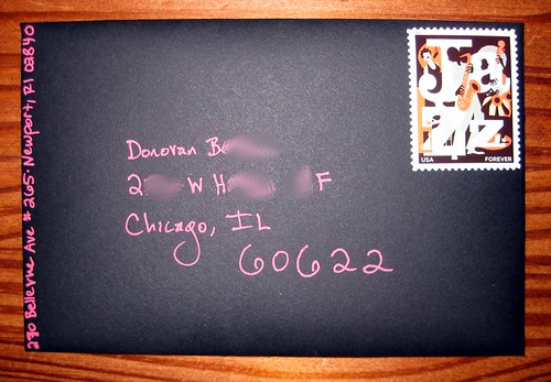
Sakura Gelly Roll Moonlight Gel ink pen on black envelope

Bright ink on black envelope

Remember my recent post about the Sakura Gelly Roll Moonlight gel ink pen from JetPens? Here's another example, except I think this is the red one. They look awfully similar and it's hard to tell them apart unless they're next to each other.

But zowie, doesn't this look grand on a black envelope? This is the first time I've found a pen that wasn't metallic, or white, that looked great on such a dark color. I'm smitten, and I do believe I'll have to get more colors.

Oh yes, and I am a huge fan of the Jazz stamp. I bought lots. LOTS.

Friday, July 29, 2011

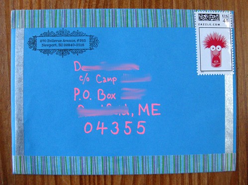
Bright birthday card + Gelly roll moonlight pen

IMG_8446crop

I sent a birthday card to a friend at camp. I wanted to make sure the envelope was nice and bright and cheery. It was fun to decorate. I save these Beaker muppet stamps for special occasions, of course.

Are you wondering about that BRIGHT pink ink? I would be. I am loving it - it comes from my new Sakura Gelly Roll Moonlight gel ink pen from JetPens. They call this color "fluorescent vermilion orange" but it looks more pink to me. I guess it depends on the light. Anyway, it POPS off of both dark and light colors, and I believe it's waterproof. Apparently it glows under a black light, too, and best of all, it dries pretty quickly. I bought this pen in red, too, and now I'm considering getting a lot more colors. They write really well on postcards, and always look really bright. I realize I didn't take any photos of the pen itself, but let's consider this a mini-review: I love this pen and highly recommend it.

Tuesday, May 18, 2010

New Letters & Journals website and newsletter (and I won a contest!!)

The Letters & Journals blog recently launched their new website, Lettersandjournals.com. This has been a long-term goal, and the website is really lovely with a lot of great content and many sections to explore. It is the next big step towards starting the magazine. I recommend you have a look at it - I had a lot of fun there, and I haven't even read all the bits about the National Stationery Show yet...

And, in a really exceptional stroke of luck, my one single entry won the contest to name the Letters & Journals newsletter. I suggested LetterNews, and that's now their new newsletter name! Jackie, founder and maven of the Letters & Journals enterprise, offered me the $50 gift card from Amazon or Jetpens, and of course I chose JetPens because they are not only one of my very favorite pen and ink retailers, but also because they are a fantastic and plucky small business, and I like to support them.

Monday, March 29, 2010

Three Pilot Iroshizuku Inks

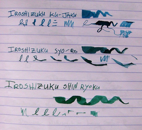
Three Pilot Iroshizuku Ink comparisons, I

Like I said, we'll be on this fountain pen ink theme for a few posts straight, folks. Bear with me.

Here are three inks from the Pilot Iroshizuku series. It's a Japanese ink that is rather expensive... some folks think it's overpriced but I've found it's pretty darn fabulous. These are probably my three favorite inks right now. If you've heard me talk ink, you know I really love the fine lines between blue and green: the blue-greens, the green-blues, etc... and I love me a good, rich, dark green. So I am completely thrilled with these three.

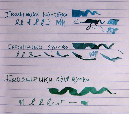
Three Pilot Iroshizuku Ink comparisons, II

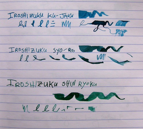
As with other ink photos, I've taken these in natural light from a variety of angles. Photographs do not do this ink justice - it has so much richness and depth, beautiful shading, and it really does look that gorgeous in a pen. I hope to have writing samples from a pen up here someday, but these are toothpick lines just like yesterday's post.

Three Pilot Iroshizuku Ink comparisons, III

These inks are starting to become more widely available in the U.S. (I can't speak for other countries, sorry, except that they come from Japan) but I bought mine from JetPens, one of the first retailers to bring them all over here. I know I've talked about JetPens before - fabulous customer service and incredible shipping rates - free with a purchase of $25 or more in the USA. Wow. Anyway, the colors I have here are as follows:

Ku-Jaku / Peacock (Deep Turquoise)
Syo-Ro / Pine Tree Dew (Dark Turquoise
Shin-Ryoku / Deep Forest Green (Deep Green)

I linked to the product pages because the bottles are so darn pretty, too. Even the boxes are gorgeous.

Most importantly, this is the best-behaved ink I have ever used. Ever. It flows perfectly, and it dries instantly. I have yet to smudge it, even from a wider nib on slick paper like Clairefontaine. Hooray! I love this ink and definitely think it's worth the heftier price tag. I still covet a couple of the other colors, particularly Tsuki-Yo (Night Sky), but those may have to wait a bit...

Thursday, July 23, 2009

Giddily pleased with 3-color gel pens

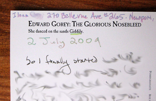
Edward Gorey: She danced on the sands Giddily

Here we have a recent Edward Gorey postcard I sent, called "She danced on the sands Giddily" from "The Glorious Nosebleed," an Edward Gorey postcard book from Pomegranate Books. I am posting more about the embellishment than the postcard itself. Look closely, or view large, and you'll see I added some "color" to the ends of her scarf, her turban and the tips of her feet. (Yes-yes, I know, I'm not terribly creative or artistic, but it was fun.) I did this just for an excuse to play with my new Zebra Super-Marble 3 Color Changing Gel Ink Pens from JetPens. They're gel pens filled with 3 different colors, so you never know what blend of the three is going to come out of the pen. It's a heck of a lot of fun. Take a look at the JetPens description to get a view of the Blue-Purple-Red pen (scroll down for full effect and photos), which in my opinion is more of a pink-purple pen in practical application.

Showing off those 3-color gel pens

I have 3 of these pens, and above you can see each used differently for writing (or underlining, in the case of "Giddily"). These puppies are SO much fun, and they look different on light and dark papers. For a buck-fifty each, I'm hooked.

And hey - for once, I'm not taking about fountain pens!