Showing posts with label review. Show all posts

Thursday, March 26, 2015

Writing desk candid + washi tape storage

WritingDesk2015March15

Well, I haven't done such a good job of blogging again this month, have I? The good news is that I've been spending a ton of time writing postcards and longer letters, which has been a pleasure. I took a photo in the middle of writing one of those longer letters recently, just to share the mood of my writing desk. I didn't really tidy it for this, so you can see the current semi-mess in action, complete with messy piles.

I didn't set out to talk about this, but as I look at the photo, I'd like to mention my new storage system for washi tape. I mention this in part because I've been really, really into washi tape especially lately, and my collection has grown... thereby increasing my need for a decent storage system. I like to use the tape outside of a dispenser and place it by hand, and I also need to be able to see all my tapes at once. You can see some of them hanging from my bulletin board on a system I've rigged with hanging them on a ribbon between two pushpins; this is nice for visibility, but a bit of a pain for retrieving the tape unless they're the ones on the end. So, the ones I use less frequently gravitate to the middle.

The new system about which I'm most excited is a little less apparent here, but you can see it under and to the left of the hanging tape rolls, next to the mug of fountain pens. They are Mark's Round Pen Cases which I got from the beloved JetPens. Yes, they are technically pen cases, but when I saw these recently added to the JetPens website, the description mentioned storage for decorative tapes, and I thought.... hmmmm.... First I bought the black case, and then I loved it so much I bought another one in white. The round shape perfectly holds the washi tape, and the clear window lets you see what's inside, and it's easy to retrieve the tapes in the middle. Now my favorite, most-used tapes live in the Mark's Round Pen Cases for fast and easy access. As you can see in the photo, they stand up nicely on their own (though they could be hung quite easily using the zipper ring), and if I need to expand, I'll get them in different colors to differentiate. They also feel very sturdy, and would stand up well to travel, I think.

You can see some of my washi tape use on the letter on the desk. I have more ideas for blog posts than I'm sure I will ever execute, but this makes me think I should review some of the utterly adorable tapes I've found recently; the designs available have exploded exponentially in the past few years, and it's pretty amazing what you can find on a tape now.

If you have any nice writing desk photos, or washi tape storage ideas, or any other thoughts, please share in the comments!

Saturday, January 3, 2015

Missive Maven round-up: 2014 in review

Outgoing mail, Dec 15

Happy 2015, readers and letter writers! A lot of momentous stuff happened in Missive-Maven-land in 2014. I just had fun perusing through some old blog posts, and thought I'd share some of the year's highlights here. (The photo above shows some of the mail I wrote for the Letter Writers Alliance virtual social on December 13, which was an absolute blast!)

Revolutionary, in boxes

One of the most exciting events of 2014 was personal in our family, but I blogged about it a fair bit: the January 2014 publication of "Revolutionary," my best beloved Alex Myers' first novel. It is "a fascinating retelling of the story of America’s first female soldier, Deborah Samson Gannett, who ran away from home in 1782, successfully disguised herself as a man, and fought valiantly in the Revolutionary War." The novel does have a significant epistolary element, so it does fit into the letter-writing theme of my blog! After the release of the novel, Alex did quite a bit of speaking and book touring, and in a later blog post, I gave an update on some excellent press and thanked you all for your support. On another note, "Revolutionary" will be released in paperback later this month, on January 20, 2015.

Sleepy Magic, Sleepy Soda

There was much heartbreak in the summer of 2014, when we lost our deeply beloved 17-year-old cats, Soda and Magic, within roughly two weeks of each other.

In Memory of Soda: April 1997 - July 7, 2014

In Memory of Magic: March 1997 - July 25, 2014

The move from Rhode Island to DC was a very difficult one for them, but they lived good lives of joy and mostly good health, and I'm so thankful for all the years we shared.

Oberon and Stella on the couch, New Year's Eve

We could not live without cats, and later that summer we adopted two kittens who we named Oberon and Stella. They brought us much joy in our grief, and it has been sweet beyond words to watch them grow up. The photo above was taken on New Year's Eve 2014, where Stella and Oberon and I spent a lot of time hanging out on the couch together. (Truthfully, Stella and Oberon spend a lot of time hanging out on the couch together in general, with or without me.) They are now 9 months old, but still very much acting like kittens!

Oberon likes my stationery shelves

And now back to more blog-appropriate news. I completed a project I'd been meaning to do for a long time: adding a page to my blog called Stationery Sources. I'm often asked where I buy my stationery, and this page lists links to all my favorite vendors, and each link has a little blurb about why I like their wares.

Melissa teaches us about envelope-making

Another wonderful mail milestone in 2014: I finally went to a mail social! I wrote a huge blog post about The October Mail Social Club at the National Postal Museum, which took place on World Post Day! These Mail Social Club events are coordinated by Melissa of Craftgasm (pictured above, showing us how to make handmade envelopes), and she does a really fine job with these events. I hope to attend at least one more in 2015! If you are able to attend one of them, held monthly at the National Postal Museum, I highly recommend it.

Letter log sent: ink used in letter

Also in the department of "blog posts I meant to write for ages," I shared a post called Habits: How I keep my letter log, about my system for recording incoming and outgoing mail. That's one of my more popular posts, and I'm glad letter-writers have enjoyed reading it.

Outgoing mail pile, Dec 15

And finally, a round-up of some of my favorite posts of 2014:

  • Fabulous mail to kick off 2014
  • Legal tender sender
  • Postcard signed by Inge Löök
  • 3D Dinosaur Stamp from South Africa
  • Essay by Alex Myers on Salon.com this week
  • Postcrossing stamp from Belarus
  • Meeting a pen pal + mobile Letterpress
  • Mozart stamp from the Czech Republic
  • October 11 is National Coming Out Day
  • Who's excited for Halloween?!?
  • Russian Rainbow Circus Stamp
  • Best Hanukkah Card EVER
  • Happy New Year, in a Russian winter postcard

    One of my resolutions for 2015: more blog posts! My blogging was a bit more sparse than I'd like in 2014, and I hope to be more regular in 2015. Thanks to all my readers for your continued readership and comments, and Happy New Year!
  • Wednesday, April 3, 2013

    Postal Travels magazine, April issue


    The new issue of Postal Travels magazine just came out, and it's full of all kinds of mail and postal goodness. Pen-pallers might want to check out all the interesting articles and product reviews... and products from Missive Maven on etsy are reviewed on pp.42-43.

    Happy reading and writing!

    Thursday, March 15, 2012

    Helping kids send mail: Scribble It! Postcards


    I've blogged before about my favorite (and youngest) pen pals. They are still both writing me regularly, and their letters and postcards are among my most cherished mail. I always give them mail-themed gifts at birthdays and such - usually stationery. The two girls are great about sharing their stationery with each other, and one of the gifts I gave Scarlett for her 5th birthday was such a hit that I had to blog about it.

    That is a cat

    Scribble It! postcards by Taro Gomi, published by the fantastic Chronicle Books, are a magical way to encourage kids to send mail, even if they can't write yet. I thought the gimmick was cute so I sent it along with some other stationery, but being a foreigner to most interactions with young children (with a few exceptions, like these lovely young ladies), I hadn't realized what a hit it would be. Each postcard has a prompt on the front for artwork and such, and room on the back to write. Scarlett chose the "Her pet is so cool" postcard, and drew me a lovely cat... and captioned it "That is a cat." I'm glad she specified - now I know for certain! :-) She added one of the stickers I'd also sent her for her birthday into the artwork. So it's clearly mixed-media: crayon, marker, and sticker.

    She wrote it all by herself!

    This was a 5th birthday gift for Scarlett, and she is in pre-kindergarten. She has previously dictated all her letters to her mom, and her mom handwrites them -- but this was the first item I've received from Scarlett that she wrote all by herself! I was so impressed. She and her sister both used stamps I sent them, made via Zazzle, featuring a photo of us last summer when I visited them and we all went to a petting zoo together.

    Interesting hairstyle

    Her older sister, Annalise, is 7 years old and in 2nd grade - she is my original pen pal and we've been writing for a couple of years now. She writes very well all by herself, though her mom sometimes helps with addressing envelopes and return addresses. She chose the caption "What an interesting hairstyle!" and created a fun hairstyle, with the addition of another sticker. I love the stripes in the background! I would never have had the artistic sense at that age to fill up the space like that.

    Colorful writing

    She wrote a very colorful postcard, changing colors every line. Her thanks for keeping her letters was in response to a question she'd asked me about whether I kept the letters she sent, and I assured her that yes, I keep every one of them! Her handwriting is always so neat. I wish I could read all my pen pals' handwriting this easily.

    Not only did I want to share these adorable postcards with you, my blog readers, but also to encourage those with children in their lives: start 'em young! My mother made me write thank-you notes as a child, as soon as I could write, and other adults in my life gave me gifts of very cute stationery to make that process fun. And so, my love of mail was born by the time I could write. If you're looking to encourage some kids to send mail, I highly recommend these Scribble It! postcards. I'm linking to Amazon instead of Chronicle Books here because Amazon lets you "look inside," and you can see a number of the cute prompt options. The postcards are large enough that there is room to fit some writing (even large writing from small hands) on the written side. They are over 4x6 so they require first-class letter rate postage and not postcard postage, but they're well worth it. This is now my favorite go-to gift for young children!

    Thursday, August 25, 2011

    New R by Rhodia tablet: my new favorite paper!

    IMG_8794lev

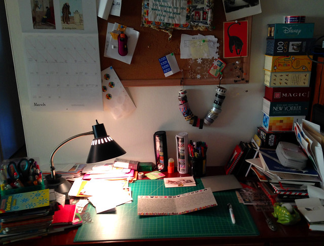
    I just got my latest, greatest order in from Goulet Pens, and I couldn't be more excited. I have been eagerly anticipating the new R by Rhodia soft-touch notepads for longer than I even knew. More on that in a moment.

    I warn you, this is going to be a long and photo-heavy review. But you already know that if your page is loading as slowly as mine is. I think it will be worth it, though.

    First, you might want to acquaint yourself with the hype. Brian Goulet did a wonderful video on his Ink Nouveau blog that gives an excellent review of the new product, and a nice overview and comparison. I wish I had remembered to take a photo of this paper in comparison to other papers, but I didn't - I think he does that in the video. Anyway, worth watching.

    IMG_8800lev

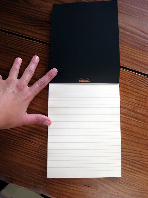
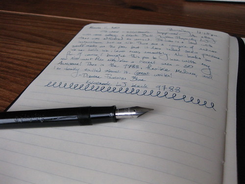
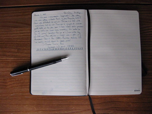
    So here is the awesome new paper. It is a gentle ivory/cream color. It does not detract from any ink color, but it's not SCREAMING BRIGHT WHITE like Clairefontaine Triomphe and most of the Clairefontaine notebooks, including my current ink journal. Nor is it screaming bright white like the other, original Rhodia pads.

    Inside of new R by Rhodia No.16 tablet, close-up

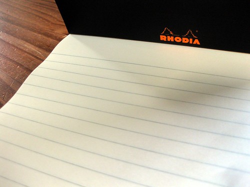
    Also unlike the other Rhodia pads, there is no margin, and the lines (this is also available in blank, but I started out with the lined version) are sort of a soft grey, not blue. Subtle. Nice touch. I like the ruling. It's a good width for me. (I just checked, for those of you that want precision: it's 7mm.)

    But it's really about the paper, and how well it takes ink. This new pad is an "upgrade" to 90g paper from the previous 80g. It does feel slightly thicker to the touch. In his video, Brian said it was nearly as smooth as Clairefontaine Triomphe, and I would mostly agree with that, but it doesn't have the Triomphe's "glassy" quality... which, in most cases, is a plus. I wouldn't say there is drag on the paper, and there is definitely not "tooth"... it's just a lovely smooth surface.

    Fountain pen ink test on new R by Rhodia No.16 tablet

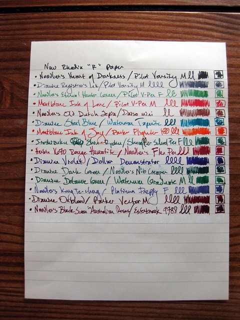
    Again, though, it's all about the ink. And this is where this paper really excels. For those who like their colors harmonious, I apologize, as I just grabbed pens with excitement in no particular order, other than thinking, "this is a juicy wet pen!" or something like that... really putting the paper to the test, as it were.

    IMG_8792lev

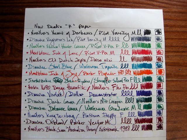
    As you can see, no feathering. Slight smudging, due to wet inks and my smudgy over-writing hands (+ general impatience). Ink dries significantly faster on this paper than on Clairefontaine Triomphe: a significant plus! All of the inks played nicely, even one of my newest, least favorite inks: Noodler's Old Dutch Sepia; this is the only paper I've tried it on yet where it doesn't feather! (It's humid here in August. That happens. I hope it will be have better in the winter, when everything, including my pens and papers, is less damp.)

    Inks and pens shown:
    Noodler's Heart of Darkness / Pilot Varsity M
    Diamine Registrar's Ink / Pilot Varsity M
    Noodler's Eternal Hunter Green / Pilot V-Pen F
    Montblanc Ink of Love / Pilot V-Pen M
    Noodler's Old Dutch Sepia / Daiso Mini
    Diamine Steel Blue / Waterman Taperite
    Montblanc Ink of Joy / Parker Flighter 180
    Iroshizuku Shin-Ryoku / Sheaffer school pen F
    J. Herbin 1670 Rouge Hematite / Noodler's flex pen
    Diamine Violet / Dollar Demonstrator
    Diamine Dark Green / Noodler's Nib Creaper (firm/non-flex)
    Diamine Delamere Green / Waterman Graduate M
    Noodler's Kung Te-Cheng / Platinum Preppy F
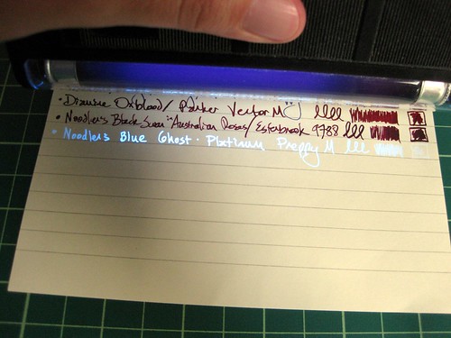
    Diamine Oxblood / Parker Vector M
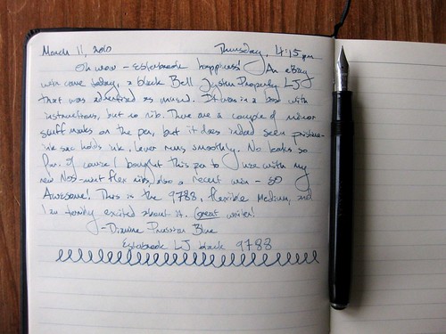
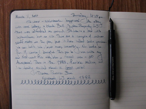
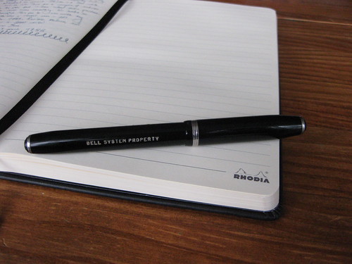
    Noodler's Black Swan in Australian Roses / Esterbrook 9788
    Noodler's Blue Ghost / Platinum Preppy M

    Writing with Noodler's LED backlight on my finger to reveal the Blue Ghost

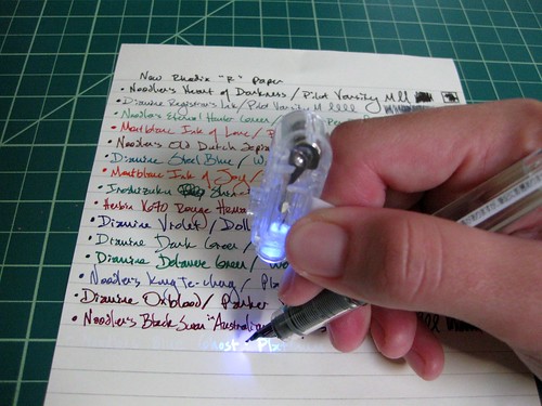
    Slight tangent - if you thought the last line of ink was Noodler's Black Swan in Australian Roses, you thought wrong! Included in my order from Goulet Pens was the awesome Noodler's Blue Ghost invisible ink, which shows up with a black light on non-bleached papers. COOOL! Goulet pens also sells this ingenious set of black light rings that you can attach to your pen or your finger as you write, illuminating in black light just your area of writing. Trust me, this is key: it is eerie to be writing if you can't see what you're writing! I'm writing with a Platinum Preppy M, which came from Goulet Pens already as an eyedropper conversion (and folks, I am happy to pay the extra $2 to Goulet Pens for them to do the eyedropper conversion for me - it's a time-saver, so this pen came all ready to go), and for a specialty ink such as this, I wanted to make sure to use a brand-new pen. Platinum Preppy eyedroppers are one heck of a great bargain for about $6 from Goulet Pens!

    Noodler's Blue Ghost under black light

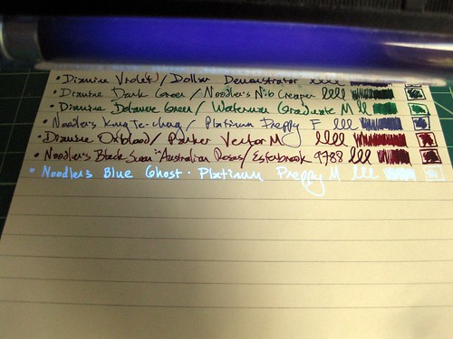
    I do happen to have a larger black light, which is handy for the reading part, not so much for the writing... but it allows me to show you the whole line of ink and not just part of a word.

    Noodler's Blue Ghost under black light 2

    With the ivory color of this paper, this ink looks fabulous! It does not show up at all in my bright white Clairefontaine ink journal... that paper is just too white.

    IMG_8793lev

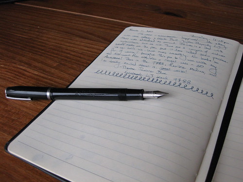
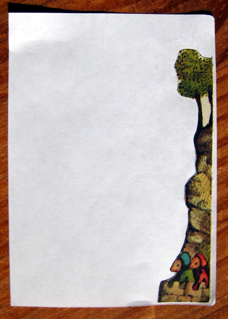
    So back to the paper. This photo above is the most exciting photo to me of the whole bunch, and if you're a real fountain pen/paper aficionado, you'll guess why. This is the back of my ink tests page. Not only is there no bleed-through, there's not even any SHOW-through! You can only tell there is even writing on the other side if you look really closely. WOW! And I even flexed my flex nibs with Noodler's BSIAR and Herbin's 1670 Rouge Hematite inks... wet inks in very wet pens! LOVE it. This, as much as anything else, is why this is my new favorite paper. I will use it for second/additional sheets in letters, and I can write on both sides with ease. It's also a great size for the sort of stationery I prefer to use.

    IMG_8796lev

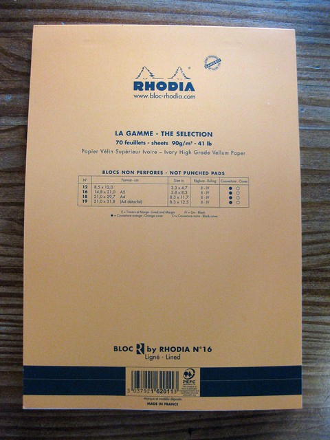
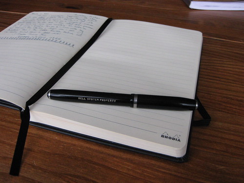
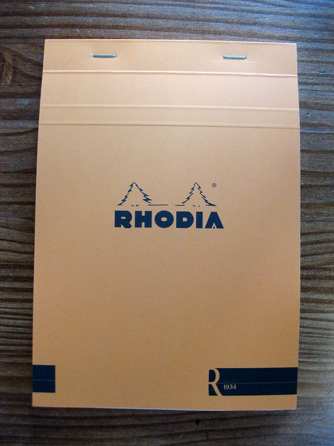
    And finally, the back of this wonderful tablet. It comes in many sizes, both lined and blank, with black and orange covers. (The inside of the cover has the inverse color.) I chose orange this time, since my other Rhodia pads have black covers.

    Important note: I am not affiliated with Goulet Pens, I am just a happy repeat customer. Here's the buying info: R by Rhodia No.16 tablet, 70 sheets for $7. This stuff is new and freshly out, but other retailers may be carrying it now as well.

    Wrap-up:
    If you wanted pretty much the paper that comes in Rhodia webnotebooks but in micro-perf tablet form, this is it.
    If you wanted "off-white Clairefontaine," this is it.
    If you want a great, high-quality writing paper for a great value, this is it.

    Highly, highly recommended!

    Friday, July 29, 2011

    Bright birthday card + Gelly roll moonlight pen

    IMG_8446crop

    I sent a birthday card to a friend at camp. I wanted to make sure the envelope was nice and bright and cheery. It was fun to decorate. I save these Beaker muppet stamps for special occasions, of course.

    Are you wondering about that BRIGHT pink ink? I would be. I am loving it - it comes from my new Sakura Gelly Roll Moonlight gel ink pen from JetPens. They call this color "fluorescent vermilion orange" but it looks more pink to me. I guess it depends on the light. Anyway, it POPS off of both dark and light colors, and I believe it's waterproof. Apparently it glows under a black light, too, and best of all, it dries pretty quickly. I bought this pen in red, too, and now I'm considering getting a lot more colors. They write really well on postcards, and always look really bright. I realize I didn't take any photos of the pen itself, but let's consider this a mini-review: I love this pen and highly recommend it.

    Sunday, April 10, 2011

    My new(ish) return address stamp

    Return address stamp 1

    In my recent post about my new mail organizer, I foreshadowed this post by noting I had another new year's gift to myself to blog about. So here we go: my new return address stamp!

    Return address stamp 3

    I got it online from Paperwink, and they were just delightful in the whole process. This particular design is called antique. I've oft admired their handiwork, sometimes on the envelopes of pen pals, and I'm really glad I pulled the trigger and got this one.

    In the photo above, you can see how nice and thick the spongy backing/mounting is. It's really springy, and I love the feel of it when I use it. The handle fits both the stamp and my hand nicely, and it seems to be very well-made.

    Return address stamp 4

    For reasons I can't quite explain, I've always been superstitious about getting a return address stamp -- thinking I'll just move as soon as I get one -- and it's a little ironic, because right after this arrived, we went through a 2-month period thinking we were in fact likely to move to another state. But we're not. We're staying here for a while, so I'm glad I got it. I purposely didn't put my name on it, just my address. These photos aren't the best, and it CAN give a better impression than this - the envelope here is textured - but I sort of like it when it fades out, too.

    Return address stamp 2

    I got one of the smaller designs so it could be stamped even on large postcards. I use this puppy almost daily, and it almost always gives a lovely impression.

    Saturday, April 2, 2011

    I ♥ my new mail organizer

    Mail organizer 1

    I got myself a couple of mail-related New Year's gifts. (I'll post about the other one soon, never you fear.) My husband saw this in a magazine and convinced me that I would love it, and he was absolutely right!

    Mail organizer 2

    I got mine on Amazon; it is the "Gramata WA8235 House Your Mail-Wooden Organizer" in Walnut stain.

    Mail organizer 3

    I took these photos back in January and my slots are a little more full now, but this is how I keep my mail piles in check. Oversize stuff has to go on the top, but all the little slots mean something in my system. It really is a big help in staying organized.

    Mail organizer 4

    I was skeptical about the size of the slots at first, but most of my mail fits nicely in there. It's attractive and practical; I enjoy looking at and using it. It can be wall-mounted, but I have a nice space near my writing desk where it fits nicely on a counter. It is a few steps away from my writing desk, so it is easy to access, but doesn't take any space away from my actual writing surface.

    I am wildly enthusiastic about this organizer. It is solid wood, and well-made. I recommend it highly to any mail enthusiast. I decided to leave my slots unlabeled, but you can see the little brass holders for labels (label paper included) where you can denote each slot's purpose or contents. I still have a couple of empty slots, but I know their perfect use will come to me soon.

    Monday, August 23, 2010

    "Write the Right Words" book review

    WritetheRightWords-4X6

    Full disclosure: I am reviewing this book for readers based on the request from a publicist. I was sent a free copy and promised to read it and share my thoughts, and I will have a giveaway for this book in a separate post. (I'll tell you more about the giveaway rules there.)

    The book is Write the Right Words: Messages from the heart for every occasion by Sandra E. Lamb.

    I was interested in the idea of writing handwritten messages in greeting cards, based on this publicity blurb:

    Every greeting card needs a personal, handwritten message to make it complete. In this comprehensive, encouraging guide, journalist and lifestyle expert Sandra Lamb offers a wealth of advice, inspiration, and examples for anyone who wants to add the perfect personal touch to their card messages---as well as anyone who wants to know the etiquette of when and what to write.


    Now, I don't think that greeting cards are the best way to write. But if it gets someone into the habit of writing letters, what the hey - any kind of introduction to that process has to serve a purpose.

    That being said, I did not care for most of the book. Let me get my criticisms out of the way in the beginning, and save the praise for the end.

    Each section lists "suggested" greetings you can write in a card, and anyone who needs to find a book to come up with "You are my Valentine, [Name]" as a Valentine's card message needs a heck of a lot more help than a book can give them. Were these awful messages just thrown in to make a page count? There is a section for social rites of passage, including a "sweet sixteen" or "quinceanera" type coming-of-age card for a young lady, and the messages are so off the mark it's laughable. "Playing grown-up was always one of your favorite things, and here you are doing it for the real!" Aside from "for the real," (is "the" a typo, or is that an archaic version of that phrase?) all that message would produce with the teenage girls I know is a massive eye-roll and further distancing from the old geezer who wrote it. Still, I will try to refrain from snarking too much - I think the messages are ridiculous myself and would never use them (and would probably roll my own eyes at most of them if I received them in a card - but full disclosure, I LOATHE sappy greeting cards), I still support the endeavor of any book trying to encourage anyone to put pen to paper for sincere handwritten sentiments. So let us say, this book is just not my style.

    Perhaps more insipid are the gender stereotypes. Nowhere in this book did I find written "this is a book for women," but it was certainly implied. Do only women write greeting cards? A fairly large proportion of my pen pals and blog readers and fellow mail artists are men, but apparently not in the Write the Right Words realm. I do not think the assumption of using "she" or "her" all the time is just a feminist retelling of assuming that "he" covers both genders. I think the author assumes you are a woman and you are writing to women, with the exception of particularly gendered cards, such as Father's Day. Here's a great gender stereotype gem from p.98 about Father's Day message etiquette: "Whether your dad finds verbalizing his feelings difficult or not, he'll still appreciate -- though he may not say so -- your heartfelt expression of love and caring on this special day." Oy! That would SO not translate into her writing style for mom. Hey, plenty of women have trouble verbalizing feelings as well, but not in this gender-stereotype land. If you are a casual reader of my blog, you may not have picked up on what a crusader against gender stereotypes I am, but since I am reviewing, I'm going to be honest - this aspect of the book aggravated me on a regular basis.

    I will say that I appreciate her inclusion of the Jewish holidays in her holiday listing (I mean, of course they should be there, but so often aren't) as well as Ramadan of the Muslim faith, and I appreciate her caution on p.75 about sending holiday greetings: "But before you do, it's important to know -- in at least a bit of detail -- the beliefs of those you're sending a message to, in order to be sure your message will add to their celebration, and not offend." Well said. For that I can forgive her slight generalizations/inaccuracies about the dates of the Jewish high holidays.

    All right, one more snark before I get to the positive ending. In a former life, I worked in publication and web design. I am a minor (but not a major) typesetting geek. If you are not, you can skip this paragraph. One would think St. Martin's Press would figure out the kerning for script fonts. On some of the section headers (like p.205), the fancy scripty letters don't line up - they usually require manual kerning in software programs - and it looks awful. But they got the kerning right for the end section, dates to remember - the header months look fine. So the layout editor either missed that, or it was rushed through to print. Yeah, I notice stuff like that. See my own blog header, the scripty words of "The Missive Maven?" I custom kerned that so that the letters would connect and look like cursive. 'Cuz otherwise it looks bad.

    Once I got to Part Four/Social Grace Messages, I started seeing some good in the book. The intro to that section is a lovely sentiment, and what made me start seeing the book in a better light:

    Beyond those simple tenets of etiquette (which are, granted, so often missing in our society)-- respect for others, consideration of the rights of others, and honesty-- there exists a whole higher realm of spiritual possibilities: connection, love, communion, and shared joy, to name a few. It's to this elevated level of relationships that this section is devoted. It requires writing from a deeper level of yourself that includes both the hand and the heart. And it requires living, and giving, from a generous spirit.

    Such generosity can be practiced and cultivated, and it reaps beautiful rewards for both the giver and the recipient.


    Hear, hear! Despite occasional cheesy turns, I couldn't agree with that sentiment more, and perhaps her target audience is one that really hasn't written a greeting card in a while, and needs to be eased into the process. But, I will share with you another quote from the "thank you" section (and really, this is where I think a lot of people can use the reference help - I fight against the notion that "letter-writing is a lost art," but I fear the art of writing a good-thank you note is indeed suffering) that I found really accurate and inspiring:

    It's been scientifically demonstrated that expressing thanks can make you happier, too, as well as spread your joy, plus a measure, back to the giver. It's a wonderful law of life: multiplying the joy.


    Again, hear hear! That is a lovely spirit from which to approach the writing of any letter, but especially a thank-you letter.

    Her "suggested messages - in steps," four pages of them, are what caused me to write in my notes, underlined, "This section redeems the book." And it does. I do feel that this is where many folks will be paging for regular help - because really, who needs help to write a little happy birthday message? - and it is very thoughtfully done. I will not detail her steps and strategies here, because I'm sure the motivation of the publicist in asking me to do this review was to sell the book, so I'll let those that are interested check it out for themselves, or enter a subsequent giveaway. But I appreciate her structure and thought it was well done.

    Another quote, from the Friendship and Family section on p.140, that I think my blog readers will find appropriate:

    Sure, the telephone is a wonderful tool and long-distance rates have diminished or disappeared for many of us, and email is great, too; but there's nothing that can substitute for finding that special hand-addressed envelope or package in the mailbox with a personal message written by the hand of someone close. It's a wonderful way to keep the lifeblood flowing between you and friends and relatives.


    Indeed - isn't this why so many of us enjoy writing letters?

    At the end of each section, she includes a number of "quotable quotes;" either as food for thought or for possible inclusion in a note, I'm not sure, but some were quite fun. One of my favorite gems from p.147:

    "Mental reflection is so much more interesting than TV it's a shame more people don't switch over to it." - Robert M. Pirsig, American author


    ...but those of you that have been reading my posts carefully for a while already know that I don't have a TV and haven't had one for many years. (And to anyone who asks me, how do I find the time to write so many letters - one of my first answers is usually "I don't have a TV." But I digress.)

    Another fine section of the book is the one on writing letters of sympathy or condolence. Many of us, myself included, find ourselves at a loss for words but wanting to offer support and comfort. She has many fine suggestions, and I earmarked one of her quotes as one I may use in a condolence letter someday.

    I did my homework for this review, and in perusing the author's website, I came across another of her books: Personal Notes: How to Write from the Heart for Any Occasion; I have to wonder how that book differs from this one, and whether I'd enjoy that one more. From the descriptions, they seem awfully similar, but that one seems to lack the greeting card focus. Interesting.

    In summary, this book is not for me, and I found the writing choppy and hackneyed at times, but I support anything that's going to get people putting pen to paper (or even greeting card) and sending something in the proper postal mail. And it did have some fine sections. I wonder how much she crafted carefully, and how much was churned out for some particular publication deadline, but I am the first to say I am hardly objective, and often a curmudgeonly fussbudget in my expectations.

    This review is part of a virtual book tour being featured on several blogs, including that of one of my pen pals and fellow bloggers, Julie of Okami-Whatever; her much kinder review is here.

    The full tour/review schedule can be found here. All of the other reviews so far, at least as I write this, are bubbly and effusive, so let my somewhat negative tone provide the variety that is the spice of life, no? I can be that one super-obnoxious picky reviewer that everyone makes fun of. I'm down with that.

    If you're interested in this book, check out my giveaway.

    And now... go write a letter!

    Friday, March 12, 2010

    Rhodia Webnotebook and black Esterbrook: journal & pen spotlight

    Esterbrook happiness

    Here's a late-night blog post that is tangentially related to letter-writing, and delves more into my pen-and-ink obsession. This entry features two items I've been coveting for a while, and have finally acquired to my great happiness: a vintage black Esterbrook "Bell System Property" pen (featuring a flexible 9788 nib) and a Rhodia Webnotebook. You'll notice there is no link for the Esterbrook, because these glorious classic fountain pens are no longer made. I am probably not going to go into deep geek level about why the "Bell System Property" pens are particularly desirable in a quirky pen-fanatic way... if you're really curious, you can read about it here. "Estie" lovers will just understand.

    sideways nib, no levels adjustment

    This post is really for the edification of many of my fountain pen friends, because only a fountain pen lover can really understand the excitement of not only finding THAT pen on eBay, but getting a heck of a deal on it.

    BELL SYSTEM PROPERTY

    There's the BELL SYSTEM PROPERTY engraving! Ooh la la. These pens were, I gather, ordered en masse for the original Bell telephone company. (I just discovered a big Wikipedia hole - there is no entry for Esterbrook! Egads!) They are somewhat common among Esterbrooks floating around out there, but if one starts falling into the affliction that is known as "collecting" Esterbrooks (and good gravy, methinks I might be on the precipice), one of these pens is pretty much required for your collection. This is an LJ model.

    geeking out with the pen shots

    In this fine Rhodia Webbie journal (which I neglected to photograph closed, but you can see it on the Rhodia website), I wrote about the pen, noted the ink (Diamine Prussian Blue), and at the bottom made the squiggly loops to try to demonstrate the medium flexibility of the nib, meaning the tines separate more with greater pressure, creating a wider line. Cooooooool. You can't do that with a ballpoint, people.

    Esterbrook & Webbie

    Some people have complained that the Rhodia logo on every right-hand page of the journal is a bit much, and I would probably agree, but I'm really happy with this journal in every other way so I'm not gonna complain. The pages are smooth, a nice light cream/off-white color, and of course they take fountain pen ink beautifully. No bleed-through, no show-through, I can easily write on both sides of the page with no intrusion. This is the A5 size.

    penjoy

    For the record, I generally do not "post" my pens (meaning put the cap on the end while I write), but I do when I photograph them: the clip keeps the peb from rolling around.

    Esterbrook LJ + Rhodia Webnotebook

    Right, I know I took a lot of photos, but I had fun. Let me note here that I really like the ribbon bookmark. Just black. Unobtrusive. Classic. Oh, and I left my writing unblurred because it's all about the pen and ink, and I'm happy to share that info with anyone who's interested enough to care.

    top shot

    Here's a full top shot so you can see all the lines in the journal. I really like that there is a slight margin, the lines don't go all the way to the end of the page; that makes it feel neater somehow. I also appreciate that the very top and very bottom lines are heavier and thicker. Again, a neater appearance.

    I guess this is pretty much a review so I'll tag it as such. The Rhodia Webnotebook is everything I'd hoped it would be.

    The Esterbrook pen came without a nib, but that's okay because I'd won an eBay auction separately with a bunch of NOS nibs, most of which were flexible. Woo-hoo! I am loving these Esterbrook flex nibs. They are just dreeeeeeaaaaaammmmmmyyyy to write with. I was really pleasantly surprised with this pen, because it was advertised as "unused." I don't know if I believe that, because there are a couple of scuffs on the barrel, but what I care about is the ink sac. These Esterbrooks were manufactured sometime between the late 1940s and the early 1960s. (Experts would know more precise numbers, but I don't.) One doesn't expect the original ink sac to be in pristine condition. Either this pen, which came in a box with the original filling instructions, has a rare pristine ink sac, or someone did a really nice re-sac job. If it is the former, I anticipate I'll have to get it re-sacked one of these days, but that will cost less than 20 bucks and be worth it for an incredible writing instrument.

    Sunday, February 7, 2010

    Troll Envelope: Making a handmade envelope

    Paper Source envelope-making tools

    Welcome to my most photo-heavy post ever! (I think. 12 photos. I didn't really count past photo stats on posts, it just feels like the biggest.) This will serve as a report and review of my fun new products from Paper Source:
    Envelope Template Kit
    6" bone folder
    Lick & Stick Envelope Glue

    So yesterday I posted about this wonderful mail art that I received. That, too was a photo-heavy post, and at the end I promised to show you today what I sent in response. Of course I had to send something I made myself, it had to be some sort of mail art, so this seemed the perfect opportunity to really dig in with the items from my recent PaperSource order.

    Placing the template

    Here we see the envelope template centered on the page of a children's book (Favorite Tales of Monsters and Trolls by George Jonsen - this is the troll under the bridge in The 3 Billy Goats Gruff). I will note that I deliberated over this template kit for a long time - some people are really crafty but I'm not one of them, and I need all the help I can get. What really sold me was the fact that you can see through the firm plastic, so you know exactly where you want to center it, and the long holes are places where you can use the bone folder to score for folding. This kit is really, really handy. I will just say right now that I love it.

    So in this case I wanted to make sure that the troll's face showed up on the front of the envelope, and that the awesome bird on his hat came out on the back flap. This template is just a wee bit bigger than the page (and it's the smallest one in the kit), but it's okay that it overlaps the page in a couple of places - those irregularities will be totally covered by the folds. My spatial-reasoning challenged brain would not have known this without the aid of the template.

    Page, template and bonefolder

    Here we see the page, the template and the bonefolder. I traced around the edge of the template with a pencil, and used the pointed end of the bonefolder to score the page. (That means to put little indentations in it that aid in the folding of the envelope.) Sorry about all the shadows from my windowpanes - it was a directly sunny day, and they couldn't be avoided.

    Bonefolder's ghost

    Now I understand why people have craft mats - the bonefolder actually made marks in my table. Good thing we don't really care! It's already got cat claw marks, ink spots, and all kinds of other marks of our lives. But I shall be a little more careful with the bonefolder in the future, and maybe put something underneath it when I am using it to score.

    Folding in the troll

    I figure the cutting part is pretty obvious - just cut along the lines traced from the edge of the template - so here we get to the folding part. I didn't photograph it in action, but you can also use the bonefolder to get really sharp creases on the folds. Trust me, it works better than a finger, and even better than the side of my letter opener, which is what I had used previously for such a purpose. So here is the partially folded envelope...

    Goats Gruff fold

    ...and more folds, pre-glue. I did not photograph the glue process, but let me just say that the Lick & Stick glue is probably the best value. It's only a couple of bucks, and that stuff is glorious. You can use it wet as normal glue, of course, but you can also let it dry so that you can lick and seal the envelopes later. This is fantastic if you are making your envelopes ahead of time, before you are sealing them, or of course if you are making them to give away or sell. I have heard tell that you can mix up your own solution for this sort of thing, but again, that's not my temperament. The Lick & Stick is easy to apply, with a spongy applicator, and I've found it's also good for reinforcing the glue on vintage stamps. Hooray for Lick & Stick!

    Troll and his hatbird

    Here's the front, before the final fold. I just so dig that bird on top of the troll's hat.

    back of the folded envelope: trollbird

    Here's the back, when the envelope itself has been glued together but the flap hasn't been sealed.

    Sunny envelope-making, with coffee

    I didn't photograph it before I cut it, but one of the strips from the page I used for the envelope had this really cute scene on it, and it was cut away from the final envelope. I decided to cut it out and glue it on a piece of paper (yay Lick & Stick!), so the "stationery" matches the envelope. You can also see my morning cup of coffee there in the sunshine.

    paper scrap from envelope becomes stationery

    Here's a closer look at that little scene glued to the paper.

    completed troll envelope, back

    And finally, the finished product! Here's the back...

    completed troll envelope, front

    ...and here's the front!

    All things considered, I am really happy with these PaperSource purchases, and I'm sure they'll see a lot of action. The Envelope Template Kit has a great video that demonstrates their use; though it is a bit annoying to watch, it is useful. It has templates for 4bar, A2, A6, A7, and 5 3/4" square envelopes.

    I hope you enjoyed the heavy documentation of my creation, and found the info useful - zowie was this an intense post to write! But good mail is worth it.