Showing posts with label Clairefontaine. Show all posts

Tuesday, August 23, 2011

Comparison of grey fountain pen inks

Grey ink comparison, scan

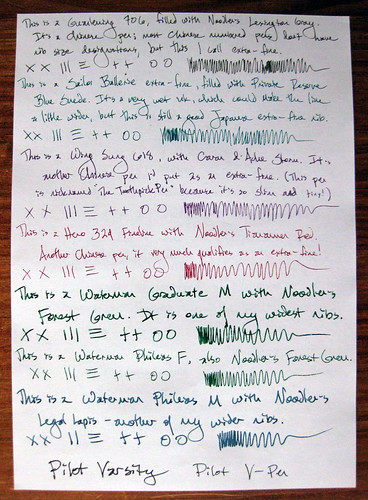
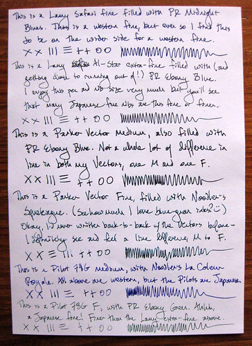
If you've read my blog for a while, you know I keep an ink journal to keep track of all my fountain pen inks. I update it every time I refill or clean a pen, so it's a great record of maintenance, and of course it helps me remember which ink is in which pen! But I also play around in it from time to time, and ink comparisons are always great fun. I had a yen a while back to compare my grey inks - or at least, the grey and blue-grey inks I had loaded in pens at the time.

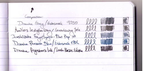
What you see above is a scan of that comparison.

Grey ink comparison, photo

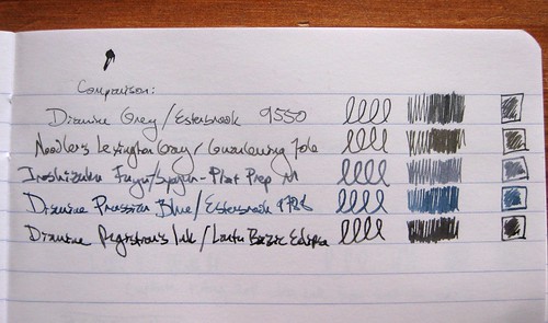
I also took a photo of the page, in natural light (indirect sunlight), and to my eyes, this one (the photo above) is a far more accurate portrayal of the colors. But some people prefer scans to photos, so in the interest of a full range, I used both imaging options.

I hadn't realized, until I put them all together like this, how very greenish the Noodler's Lexington Gray is.

The inks and pens listed above:
Diamine Grey / Esterbrook 9550 (EF)
Noodler's Lexington Gray / Guanleming 706 EF
Iroshizuku Fuyu-Syogun / Platinum Preppy M
Diamine Prussian Blue / Esterbrook 9788 (M)
Diamine Registrar's Ink / Lantu Bazic Eclipse M

The Registrar's Ink and the Lexington Gray are both waterproof, so they show up on postcards with some regularity. The others are for the innards of a letter or a journal.

Do I have a favorite? I guess I'd have to flag the Iroshizuku Fuyu-Syogun and the Registrar's Ink as current top picks, both for the color and behavior.

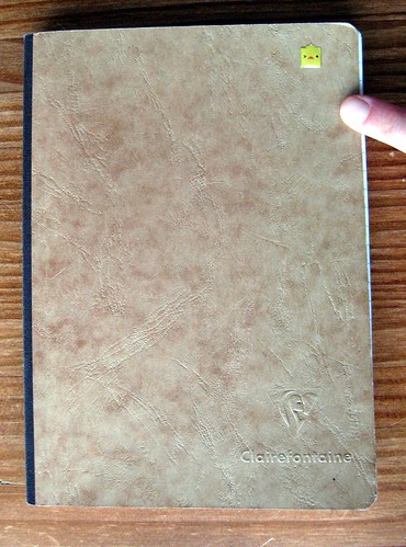
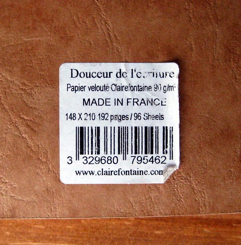
For those who are as geeky as I am about this sort of thing, these comparisons are in a Clairefontaine Basics clothbound journal, just like this one I blogged about over a year ago, except the current incarnation has a black cover. I'm pretty happy with using this journal as an ink journal, but when I finish this one, perhaps I'll branch out. Who knows.

Friday, April 16, 2010

A peek at my Clairefontaine ink journal

Clairefontaine notebook/ink journal

I've mentioned my ink journal and shown samples from the pages so many times, I guess I should show you the outside! Here's the front of my pretty simple but perfectly useful Clairefontaine ink journal. It is the smaller Clairefontaine Basics clothbound journal, and...

Clairefontaine notebook tag/back of my ink journal

...hopefully this tag tells you everything you need to know.

Friday, July 24, 2009

Clairefontaine Pollen small flat cards

Clairefontaine Pollen small flat cards

My first Exaclair goodie review shall be the Pollen small flat cards. These are the 5 x 3.25 size in light grey. (The fountain pen shown is a Sailor Ballerie XF, quite a slim pen.)

Clairefontaine Pollen small flat card

I hope in this photo you can see that the envelopes have a self-adhesive closure; pull off the wax backing, and they'll seal themselves. I have no idea why they do this, but it's kind of nice. The paper weight is heavy but not cumbersome, and it's no surprise that it takes fountain pen ink beautifully. (I've not met a Clairefontaine paper that doesn't.)

Clairefontaine Pollen small flat cards

Since the marketing copy on the envelope notes that stamping is one of the intended purposes, I thought a rubber stamp was in order. This went to a cat lover, so of course I got catty with it. Indeed the card did take the stamped image beautifully. The ink shown is Private Reserve Blue Suede (riding in the Ballerie that you saw above), which is normally a very smeary, slow-drying ink. I am pleased to report that it dried more quickly on this paper than on my beloved Clairefontaine standby, the Triomphe writing tablet. The Pollen is not as smooth as the Triomphe, but I'd hardly call it toothy. I'd say this is great stuff for stamping. I didn't photograph it for a review, but in using the larger Pollen notecards, I stamped those with a different stamp, and it also did quite well.

Clairefontaine Pollen envelope

I hope this photo of the envelope can show you a fairly accurate portrayal of the light grey color, in contrast to the white border on the Memo stamp. (Yes, Memo is another one of my cats.) Actually the color is my biggest complaint here. Normally I am a grey fan, but this grey is just kind of boring. Instead of having any color tones or depth, it looks like a dingy cream. I swear to you that the back of my package says "light grey," but in the Pollen color listing on the Exaclair page, I see no light grey - only pearl grey, dark grey and silver. I think this must be pearl grey, it says 88 next to that color name and the label of my package also has an 88 on it. The dark grey looks too dark for me, so I can only hope the silver is a little more interesting. But I think the only colors I would choose would be ivory or white; I prefer to show off the color of a fountain pen ink and not let the color of the paper get in the way. Oh yes, this cat rubber stamp is an Edward Gorey cat.

Clairefontaine Pollen envelope

The back of the envelope sports a second impression from the same Gorey cat stamp inking, plus a photo sticker of my cat Magic making one of her many charming faces (and sticking out her little pink kitty tongue). I do like the cut of the envelope, or the fold, or the pattern - whatever you call the way the pieces fit together in the back. And this envelope is certainly sturdy; again, not unwieldy, but should stand up well in any postal service handling.

Also, the paper and envelope are both sturdy enough to stand up to some interesting crafting options. I wouldn't hesitate to use glitter glue, spray glimmer mist, or do things a bit more hearty or "wet" to it.

Overall my impressions of this are quite positive. I enjoy writing on it, and am pleased that it takes ink so well, but is thick enough never to show through. Granted, I used an extra-fine nib to write, so if I have any bleeding or different results with a medium nib, I will be sure to report that... but I really doubt I'd ever see bleeding on Clairefontaine.

Oh yes - the retail price is $5 for 5 flat cards and envelopes - not a bad deal at all, I'd say.

Exaclair samples, many reviews coming

Exaclair box-o-goodies

The Bastille Day offer on the Quo Vadis blog, an opportunity for their blog readers to request and sample any red or blue J. Herbin fountain pen ink, seems generous, oui? So I said, what the heck, I'll probably never buy one but I'm up for sampling the Eclat de Saphir blue ink, after it looked so nice in Biffybeans' review back in October. (I've seen it in a few letters, too, and thought the color looked pretty groovy.) The very generous Karen at Exaclair offered to put together a nice package for me including some papers to review, since they were sending me the ink anyway. She even asked for, and honored, my color preferences - waaaay cool. But man, I didn't expect such a boon in a box! I am not going to do the math on this, but this is a lot of money's worth in some very fine stationery.

As you probably know if you've been reading my blog for a while, or reading my letters, I am already a big fan of Clairefontaine and G. Lalo papers. Good stuff. But Karen did a fantastic job of sending me some of their products that I haven't tried before.

As the lovely Miss Soda must be present for any unpacking of a glorious cardboard box, she joined the photo shoot to help display these products. (I can't help noting that her loveliness is sitting next to my hands, just in front of my keyboard, purring melodiously as I type. I love this cat.)

Soda inspects Exaclair samples

I promise, when I actually review each of these items individually, I will get their names right and provide full links. For the time being, I'll tell you that from Clairefontaine we have some Pollen stationery in grey, in two sizes (a larger notecard and a smaller flat card), and a little red wire-bound spiral notebook. From J. Herbin there is the promised Eclat de Saphir blue fountain pen ink. From G. Lalo, a tablet of Verge de France paper in ivory with matching lined envelopes (the cover of this tablet is what is glittering gold in the top photo of the items still packaged in a box - cooool; I capture glitter totally inadvertently), Mode de Paris boxed flat cards, small blue flat cards with lined envelopes, and green-bordered flat cards with green envelopes.

Exaclair goodies: the Soda test

Now I'm just shamelessly showing you more photos from different angles, just to show off how cute Soda is when she inspects my new stationery items. (Oh yes - that's my happy gin and tonic in the corner.)

Exaclair samples: Soda approves

It's official: Soda approves. (That's her "I'm so happy I'm purring with my eyes closed" smile, which is kind of freaky in photos because it makes her eyes look like they disappear.)

Stay tuned - each of these fine stationery products will get a review in the coming weeks. I'll give a spoiler already and say I'm liking the Eclat de Saphir a lot better than I expected.

Wednesday, May 13, 2009

Fountain pen and inks comparison

Fountain pen ink writing samples 1

One correspondent was asking about what fountain pen nib size to choose, so I gave her a showing of a few of my various sizes. I was going off on a bit of a tangent about how much thinner a Japanese fine is than a western fine, so you'll see that in my writing. I was trying to showcase my finest and extra-fine nibs, so all of my very finest (fine being a measurement of line width, that is) will be in these shots.

Inks shown above:
Noodler's Lexington Gray, Private Reserve Blue Suede, Caran d'Ache Storm, Noodler's Tiananmen, Noodler's Forest Green, Noodler's Legal Lapis, Pilot Black.

To get a better idea of the colors, best viewed large.

Fountain pen ink writing samples 2

Inks in second shot:
Private Reserve Midnight Blues, PR Ebony Blue, Noodler's Squeteague, Noodler's La Coleur Royale, PR Ebony Green

Again, best viewed large.

These writing samples are on Clairefontaine Triomphe paper.