Tuesday, April 27, 2010

Vintage European scenes postcards

Vintage postcards from Europe

A very generous blog reader in Connecticut sent me these postcards. If I recall correctly, the writer supposed that a relative had brought them home as souvenirs after a tour of military service overseas. Is my historical photograph/paper age sense incorrect, or do I surmise that these may date closer to WWI than WWII? I believe the scenes are from France; they are not all labeled but the ones that are seem very French. There are a couple of chateaus. (Chateaux?) I just know that they are so gorgeous I'm not even sure I'll be able to use them! My favorite one is on top, the dungeon-looking door with the light shining through... spooky yet lovely.

Unused vintage postcard, back

Here's the back of one...

Unused vintage postcards, back

...and here's another. I am honored to be the recipient of someone else's history!

Sunday, April 25, 2010

Soda guards my mail

IMG_5950

After I sort the day's mail (my beloved does get some mail, occasionally), my personal letters usually sit in a wee pile until I sit down and read them in one fell swoop. Soda often beats me to it - she knows a lot of my attention goes to mail - and sits upon them, so that I must pet her sufficiently before she will relinquish them.

IMG_5949

I know I'm being a little indulgent, posting 4 photos of her settled on this one day's mail pile...

IMG_5952

...but hey, I think she's really cute.

IMG_5953


Thursday, April 22, 2010

This scares me

Scary

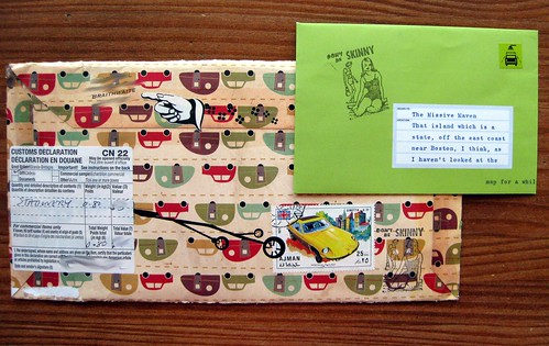
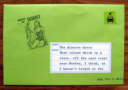
While I applaud the effort anyone puts into a handmade envelope, I've been mulling over these two for a while. I've got a few big philosophical things to say about them, first and foremost that I find them deeply, deeply disturbing.

I grant you I don't have a TV. I don't follow or worship celebrity. I am blissfully ignorant of pop culture, and I don't think you could stuff a fashion magazine down my throat if you tried. I am deliberately distant from this crap, and such deliberate distancing was crucial to my personal process of healing and rebuilding my own body image. (In my youth, I was NOT so distant from such advertising culture.) There is a reason I find this blather appalling, and this pretty much sums it up.

No wonder our women, especially young girls, have serious body image issues (and eating disorders and cutting disorders and everything else that goes along with self-hate) when they're barraged with this crap... and then internalize it as their standard of beauty.

Emaciated

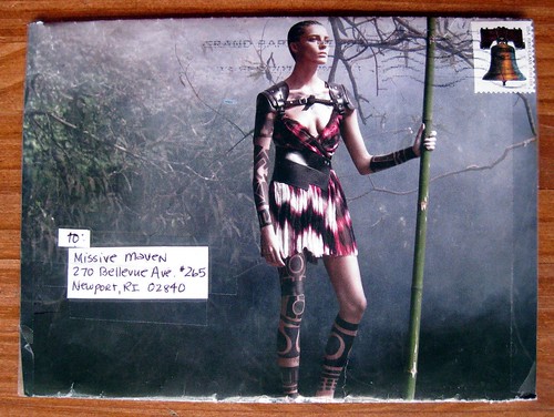
So here we have the emaciated warrior. I will confess I like the woman warrior aspect of it, but good lord, this waif hasn't the muscle to heft a spear! She is skin and bones, people! I look at this skeletal frame and wonder if she actually has enough body fat for her body to function hormonally. If I saw a young woman like this, I would be concerned about an eating disorder. This is so skinny it repulses me, and it repulses me further that women see this starved image and aspire to look like that.

Creepy

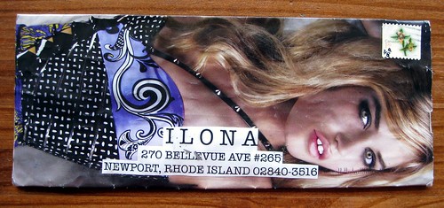
Now, creepfest #2. I can't see enough of this one's body to know whether she's got a healthier figure or not, but let's deconstruct that eye makeup. Good lord, this woman looks beaten. She looks happy to be beaten. You have to turn this envelope over to see the rest of the ad, but...

Disturbing

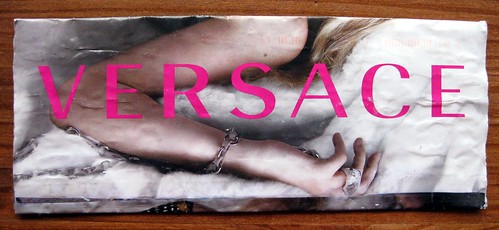
...look! She's kinda sorta chained up! WTF?? Chained and beaten? And this is sexy? What, exactly, is this ad selling? (I'm not even sure- clothes? perfume? a submissive woman?)

I'm not a prude, people, and I love me some good pin-ups. There is a big difference between showing powerful, sexy women and objectifying women and starving them. I'm sure we can argue the finer points of this, and I imagine this blog post will generate some interesting comments... but I just have to go on record by saying that images like this creep me out. I have a very, very different standard of beauty. [Edit: Please keep your comments polite. Mean-spirited comments will not be published.]

Oh, and by the way...

...operationbeautiful.com is well worth a visit any time, but especially after reading this post.

Tuesday, April 20, 2010

Vintage campers with great pointing hand

Vintage campers with great pointing hand

Here's another dandy offering from one of my witty UK typing mail artists. (Have a look at another one of his fine recent offerings here.) This letter included some fantastic aerogrammes which I've yet to photograph, but I am sure I shall do so someday...

So check out this fabulous handmade envelope with the little vintage camper/transportation theme. Tres mid-century kitsch, right up my alley. And why am I so gaga over pointing hands? What is it about them that makes them so essentially awesome in mail art? The stamps are also fabulous, of course - more James Bond, a little old car, and a fairy from the mythical creatures Royal Mail set.

vintage campers envelope, back

Here we have the back of the envelope, plus the inner envelope held within. And lo - another pointing hand!

Don't be skinny

The piece de resistence is this "Don't be skinny" rubber stamp. Wow. I am in awe. I dig the way he specified my location, too.

Sunday, April 18, 2010

Effect of volcanic ash on international post?

I've been doing some light searching on this, and I don't have any real answers. I have to assume that since most flights are grounded, international cargo (and mail) isn't moving around much either. Of course I couldn't find anything about the U.S. Postal service (certainly not on its own website!) but I did find this link, which said, "Europe's largest mail and express delivery company Deutsche Post said it was switching to road transport where possible."

Of course road transport is not possible between here and Europe, so I'm settling in for an indefinite wait in delivery and arrival of a good deal of international mail. I've got quite a few correspondents in the UK, Finland and Germany in particular... and I guess those Postcrossing postcards I just sent to Germany and the Netherlands are going to hang up in limbo for a while, too.

What a fascinating and amazing turn of events, this volcano!

If anyone knows of any postal information for specific countries, do comment and fill us all in. (Thanks to a very helpful comment from Erasercarver, I can share this like to Royal Mail to learn what's going on in the UK.)

Half a postcard

Ripped kitty postcard

Here is one of my most recent and unique mail anomalies - an international postcard that arrived ripped in half. What a cute little kitty! What does the rest of this illustration show, I wonder?

Half a postcard

I got the half with my address, but not the stamps. Thank goodness her signature is legible, and if she wouldn't have said "greetings from Helsinki," I would have had no idea from whence this came. So, Anu L. in Helsinki, Finland, your postcard did arrive, although it was mangled. (Sometimes, if the US postal service mangles something, it will arrive in a plastic bag apologizing for the damage. This didn't happen - it was just half a postcard in my mailbox.) I can't write you back because I don't have your address. Maybe it was on the top half of the postcard!

I've actually gotten quite a few postcards with no return addresses lately, incidentally... Sometimes I write people's addresses down in a little book, and sometimes I don't. If you want to guarantee a response, give me a return address, even in tiny writing on a postcard. (I put a return address on EVERYTHING.) If you don't use a return address, please do not expect to hear back from me.

Friday, April 16, 2010

A peek at my Clairefontaine ink journal

Clairefontaine notebook/ink journal

I've mentioned my ink journal and shown samples from the pages so many times, I guess I should show you the outside! Here's the front of my pretty simple but perfectly useful Clairefontaine ink journal. It is the smaller Clairefontaine Basics clothbound journal, and...

Clairefontaine notebook tag/back of my ink journal

...hopefully this tag tells you everything you need to know.

A whole lotta reds, burgundies, and some imposters

Quasi-burgundy (??) samples

Remember that post about my ink samples from Pear Tree Pens? Well, here are toothpick samples of many of them. In the aforementioned post, I mentioned my quest for the perfect burgundy. Let me tell you, none of the above samples are it! I will reiterate my distaste for pinkish burgundies, and most of these seem to be that. Diamine Claret? Come ON, people, that is just HOT PINK! The caveat is that these inks DO look different in pens, I have put some of them in pens and discovered that I still don't like them. The Mandalay Maroon and Diamine Maroon are both chalky, and just not the color I wanted. The Visconti Burgundy is quite nice, actually, but to me it is more of a red. Some of my own dark reds are closer to burgundy than the Visconti Burgundy. As for the Herbin samples, I've never met a Herbin red I liked. Those won't even see the inside of one of my pens. (Golly, maybe I should do a giveaway of all these wee ink samples I don't like!)

Burgundy/Dark Red inks

This photo, for comparison's sake, shows the dark red/burgundy inks I DO like. Many of these are in bottles, a few are samples. You have already seen examples on this blog of how different some of these inks look in a pen (see "a few red inks"). I don't really consider Monaco Red or Tiananmen to be burgundy or maroon, but they're great dark reds. PR Burgundy Mist is a GREAT color, but it dries really slowly (as nearly all the PR inks do), and that color is infamous for turning to brown after the bottle has been open for a while. R&K Alt Bordeaux is one of those purplish burgundy inks I actually DO like; can't really say why, it's just a color I really dig. I have that in one eyedropper pen that needs a refill right now, hmm.... Interestingly, Caran d'Ache Storm actually looks much darker in a pen - I don't care for this toothpick sample, but in a pen it's lovely. I only have a sample of that, but someday I may buy it in a bottle...

For search purposes, inks shown in this post are:
Diamine Amaranth
Diamine Maroon
Noodler's V-Mail Mandalay Maroon
Visconti Burgundy
J. Herbin Rouge Caroubier
J. Herbin Rouge Bourgogne
Diamine Claret
PR Black Cherry
PR Burgundy Mist
Caran d'Ache Storm
Noodler's Red-Black
Noodler's Swishmix Burgundy
Noodler's Tiananmen
Noodler's Widowmaker
Diamine Monaco Red
Rohrer & Klingner Alt Bordeaux